This article is brought to you by StatBanana, the best Overwatch strategy tool.
Imagine the penultimate battle for an objective point as the clock ticks down in a game of Overwatch. As overtime ensues, your team uses all six of their ultimates in a final, heroic attempt to defeat the enemies. Amidst all the chaos, you look at the kill feed, expecting a team wipe. Instead, the enemy Tracer has decimated your healers because you couldn’t see her through the eight million bright pixels of six ultimates going off at once.
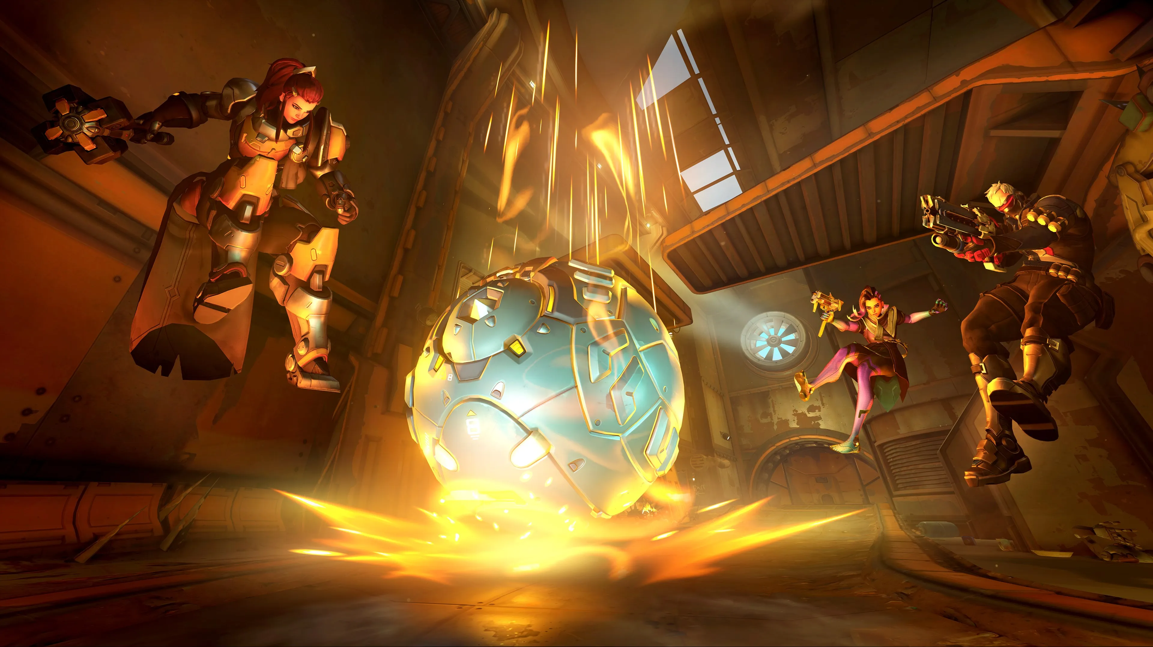
This may be a specific example, but it’s a representation of the overwhelming “visual clutter” that’s detracting from the Overwatch experience.
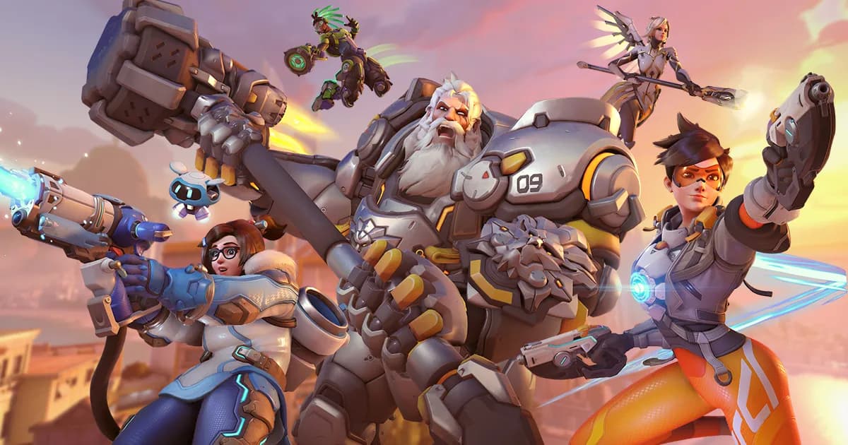
Overwatch has always been a colorful, busy game and developers have used that to their advantage. Many gamers are drawn to Overwatch because it’s a first-person shooter (FPS) that doesn’t rely on the post-apocalyptic color scheme of gray, brown, and more gray. But as more heroes are introduced with incredibly distracting, large-scale abilities, it’s harder to remember the true point of the game—or even what you’re doing within a fight.
“What am I seeing?”
Earlier this week, streamer Arrge posted a video on Twitter simply titled “Epilepsywatch.” While it doesn’t have the most politically-appropriate title, the video perfectly encapsulates the overwhelming amount of visual clutter that Overwatch is dealing with at the moment. In this video, five ultimates and three character abilities are used. Each one adds unique visual clutter to the screen.
Both Arrga’s team and the enemy team use Moira’s Coalescence, which is a beam of opaque, shining light. The enemy team uses Ashe’s B.O.B., which sends out a large omnic to disrupt the team. Both teams also use Symmetra’s Photon Barrier ultimate, which puts up a glowing barrier across the entire length of a map. Symmetra’s primary fire is a beam of opaque light that crosses the screen as well.
Multiple shields are used throughout the fight. Sigma’s Experimental Shield is sent out into the middle of the fight. This shield can take up at least a quarter of the screen, depending on where the player is. Both team’s Orisa players drop their shield to protect teammates, and this shield can take up the entire screen if a player is behind it. One Orisa also enables Fortify, which makes her glow while defending against damage.
All of this happens within a span of 30 seconds. Most, if not all, of these effects overlap, creating absolute visual chaos. A player in voice chat even remarks, “what am I seeing?” In this video, it’s hard to identify what the target of the friendly team even was. For most of the clip, they’re trying to take down the enemy B.O.B, who can hardly be seen past the shields and Moira ultimates.
Sigma was introduced to the live servers with the latest patch and he brought a new visually-disruptive shield system as well as an ultimate that lifts up an entire team. We can’t solely blame new heroes for causing visual clutter, however. The problem has plagued Overwatch for some time.
This clip from former Overwatch League player Brandon “Seagull” Larned’s stream also demonstrates the effect of visual clutter. It includes multiple shields, the presence of at least five visually-disruptive ultimates, and a lack of an obviously-identifiable target. What’s the difference between this video and Arrga’s Twitter clip? Seagull’s example is from May 2018.
Visual clutter, game chaos
Overwatch fans aren’t in favor of all the chaos. A quick Google search of “visual clutter in games” brings up dozens of social media comments directed at Overwatch, even though the search is general. While visual clutter within the game is mostly an inconvenience for most players, it begs the question of who else is being affected.
With the Overwatch League expanding globally next year, audiences may have to wrestle with making sense of all this chaos. New viewers can only learn so much through the help of friends or experienced analysts. When Sigma gets introduced to the season two playoffs, which begin on Aug. 30, observers and casters will struggle to keep viewers focused on what’s really important amid all the shields and sparkles.
For players with disabilities, like visual processing disorders or epilepsy, visual clutter may make Overwatch unplayable. While the game has made leaps in accessibility thanks to subtitles and colorblind options, it may not be enough to even the playing field for some populations.
Clearing the screen
The Overwatch developer team has shown that it’s willing to listen to the needs of the community as the game grows. Blizzard has altered maps for ease of play, changed entire hero kits, and added functionality to expand the game’s horizons. Reducing the amount or at least the obvious presence of visually-disruptive ultimates and abilities would be well within the company’s wheelhouse.
Turning down the opacity of many ultimates would easily make the playing field less cluttered. Recently, developers increased the opacity of D.Va’s Defense Matrix, making it easier to spot. Why couldn’t that same functionality be used to reduce the opacity of incredibly obvious ultimate abilities?
Symmetra’s Photon Barrier, for example, extends across a player’s entire screen. If the incredible brightness of this ultimate was turned down, players would still be able to notice when it was used. The same can be said for Moira’s Coalescence, where a lower opacity would make it easier to aim and track enemies within it.
Overwatch has millions of players and fans hoping for a game that will outlast its competitors. With new heroes being added every few months, Blizzard needs to make reducing visual clutter an absolute priority as the game gets more complicated. Much of Overwatch‘s key audience may not have the patience to sort through the static of complicated, overly-colorful teamfights and it could spell disaster for the title if it isn’t remedied.





Published: Aug 27, 2019 04:46 pm