The upcoming patch for the last act of episode five is giving the VALORANT user interface a whole new look. From changing the victory screen to the home screen, Riot Games has made sure the client feels as flawless as possible.
Here are all the UI changes arriving with Patch 5.08.
Homescreen
The first change players will encounter when booting up the game is a new home screen. Like before, the friends list will be displayed on the right-hand side but will now be accompanied by battle pass and mission progression. On the left are all the new buttons for players to navigate. There is a large red play button followed by career, battle pass, collection, agents, and store. These were previously located at the top of the screen but can now be seen on the left. Players can now clearly see what episode and act they are on by viewing the banner in the top left of the screen opposite the settings tab.
Lobby and pre-match loading screen
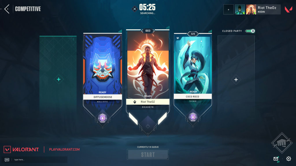
It’s not just the home screen that’s getting updated either. There are new interfaces for the lobby and pre-match loading screens.
The background has become darker and a new start button can be found in the middle of the screen. This is accompanied by a new match found transition as well. In the lower right is where players can tweak their settings and check messages. To invite others, players will have to hit the “+” in the upper right-hand corner. The loading screen has gotten a similar treatment, making the lettering more visible and taking away from harsh lines.
End of game screens
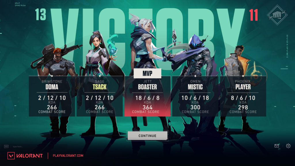
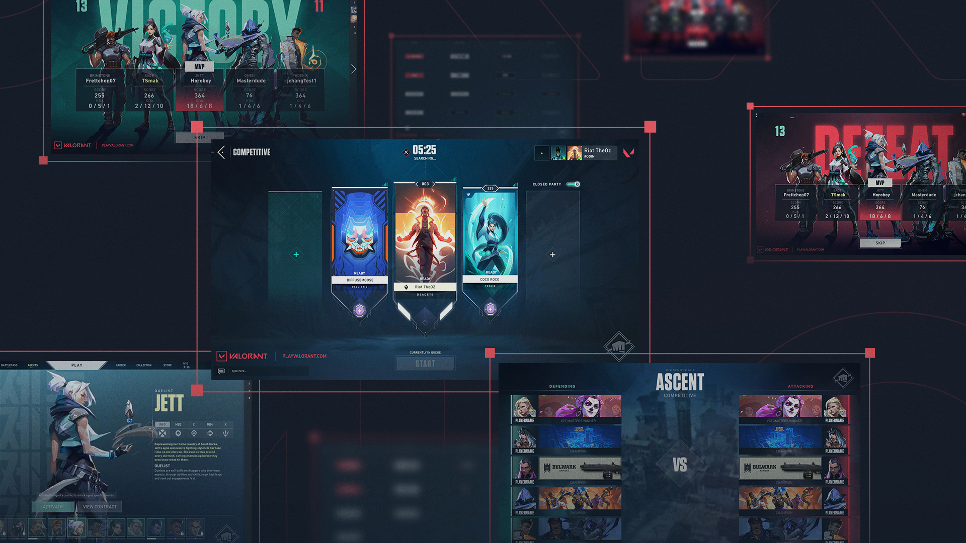
One of the most anticipated changes coming with the new patch are the upgraded victory and defeat screens. These will feature cutouts of the agents with boxes for the player’s username and their KDA followed by combat score. The MVP for the team will be listed in the middle with the other players around them. For the map count, the number of rounds will be displayed in the upper right and left-hand corners of the screen. Like the backgrounds on the screens, the winning round number will be colored green while the losing number of rounds will be displayed in red.












Published: Oct 14, 2022 04:30 pm