There are plenty of tweaks and quality of life improvements for the full release version of MultiVersus, but not all of them are necessarily welcome.
In beta versions, MultiVersus had a zoomed out and all-encompassing arena display. Characters looked small, but you could see what was going on anywhere on the map. Now, the character models appear much larger, and the camera is considerably more zoomed in. While this zoom level cannot currently be adjusted, there are several other UI tweaks you can make that should make it easier to get used to the new display. Here are all of the camera settings you can change in MultiVersus.
How to change display settings in MultiVersus
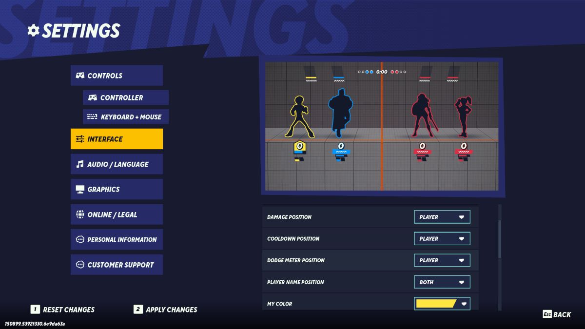
You can tweak your display settings from Start > Settings > Interface. While camera zoom isn’t among the customizable options, there are some things that I’ve found help make things appear less crowded. The settings that can be changed are scoreboard position, damage position, cooldown position, dodge meter position, and player name position. Additionally, you can toggle character outlines on or off for yourself, allies, and enemies individually and change the color of any outlines.
If you’re having trouble getting used to the new zoomed-in display, there are some settings I’d like to suggest I personally have found very helpful. The logic here is that larger character models crowd the screen, and limiting the UI elements attached to player models makes for less visual clutter. The settings I’m using are:
- Scoreboard position: bottom
- This frees up more space in the air for the larger characters
- Damage position: scoreboard
- This removes visual clutter by limiting moving UI elements
- Cooldown position: scoreboard
- It instinctively felt like this would be a bad idea, but by keeping these static on the scoreboard, you’ll be looking at the same spot for cooldowns every time no matter what.
- Dodge Meter position: player
- I like assassins with high mobility, so this is one I wanted to keep on my character.
- Player name position: scoreboard
- There’s no reason you need to keep track of player names during a fight, and this frees up a ton of visual room
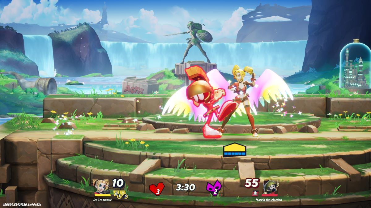
By using these settings, I’ve found that the larger character models don’t make the screen feel nearly as crowded. Here is a picture of a match using these settings for reference:
While you’re making these tweaks, I’d also suggest popping over and changing some keybindings, which makes parrying so much easier.
Can you zoom out the camera in MultiVersus?
At the time of writing, there is no way to adjust the zoom level of the camera in MultiVersus. This means that for the time being at least, the larger character models and close-up view are both here to stay.
This is understandably a frustrating change if you were a fan of the old zoom-level, but I will say that personally it didn’t take very long for my brain to adjust. After a couple of hours, you’ll hopefully find you’re no longer noticing anything has changed.
The other thing you can do is use the settings outlined in the previous section to free up more of your screen. With a closer view port, it’s easier for things to look crowded and distracting. If things are feeling stuffy, I’d recommend adjusting the size and position of UI elements so that they won’t overlap with the larger characters quite as much.




Published: May 28, 2024 04:59 pm