Now that all 12 inaugural Overwatch League teams have been revealed, it’s time to get the competition going. Sadly, the preseason doesn’t begin for another month or so. As part of joining the new league, teams needed to come up with new team names and brands. Since they can’t play against each other just yet, the next best thing is to pit the teams against each other in a battle of design supremacy. This isn’t about the team names. It’s definitely not about the rosters. This fight is all about the team logos. It’s about which one looks best, which one looks worst, and which one you would rock on a hat or a t-shirt. Let’s get to the rankings.
12) New York Excelsior

We’re not entirely sure what’s going on here. Is it supposed to be a flag, the design on a throw pillow, or something you’d see on a shirt inside of a Jersey Shore night club? The color scheme is fine, but that logo…needs some work. The Big Apple deserves better than this.
11) Florida Mayhem

Sometimes, simplicity is cool. If something is quick, to the point, and immediately readable, it could be nice. But this one is just way too simple. The palm tree is a nice touch, but we think more could’ve been done, especially with an over-the-top name like Mayhem.
10) San Francisco Shock
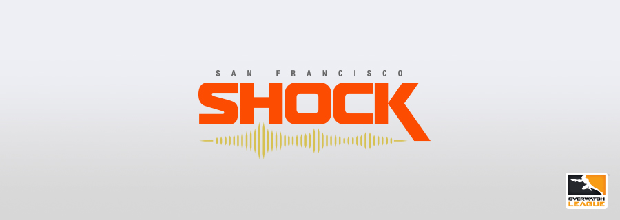
The lines underneath the lettering are supposed to evoke earthquake tremors and even the Golden Gate Bridge. But it’s just too little. Plus, the lettering is not cool enough to stand on its own.
9) Boston Uprising
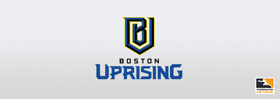
Interlocking letters are a staple of sports teams everywhere, so that’s not an issue here. The main problem is that the B and U are not immediately recognizable when you look at the logo quickly. The black accents are pretty cool, though.
8) Philadelphia Fusion
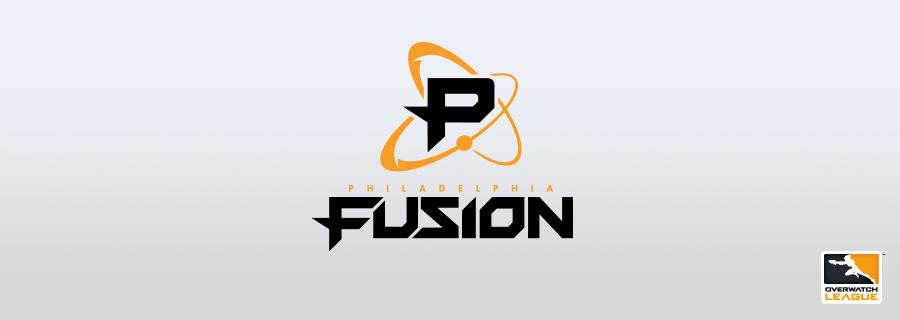
There’s not too much to explain for this one. It’s a P for Philadelphia inside of a nucleus. It’s quick and to the point. Not a bad logo, but not necessarily a good one either.
7) Dallas Fuel
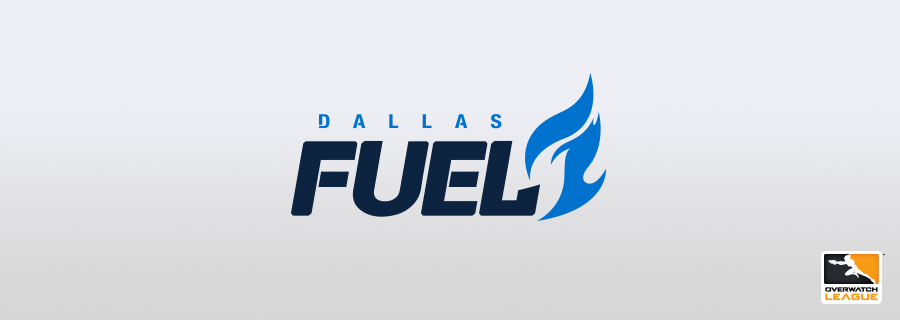
The dueling blues make this one of the prettiest color schemes in the league, and the imagery of fire from fuel is cool enough. But they are the Dallas Fuel, and not the Dallas Flames or Fire, after all. An alternate logo for this squad could be a gas pump.
6) Los Angeles Gladiators
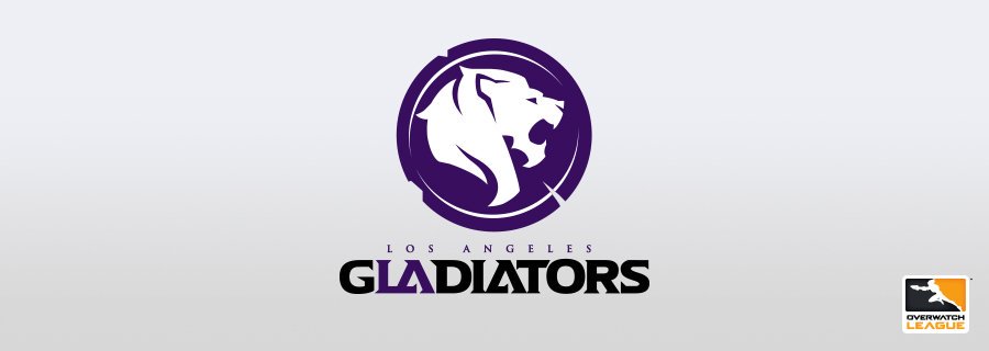
This logo is designed really well, and it looks like it belongs to a modern sports team. The lion head on a shield with a purple, black, and white color scheme screams professional sports. The purple “LA” within the Gladiators lettering is also a really cool touch.
5) London Spitfire

Now we’re getting into the good ones. This logo evokes a patch that a fighter pilot would wear, as the team’s name would signify. It’s a classic badge-type logo, something that is common in traditional sports. The color scheme is unique and really helps the imagery pop.
4) Los Angeles Valiant
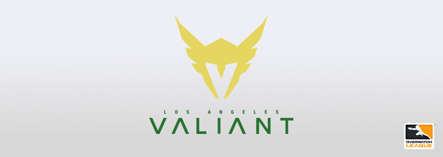
This is a case where simplicity wins out. The valkyrie helmet is a flat yellow color and the design is immediately recognizable for being what it is. Upon further inspection, though, the V inside of the helmet’s face hole takes it to another level.
3) Shanghai Dragons
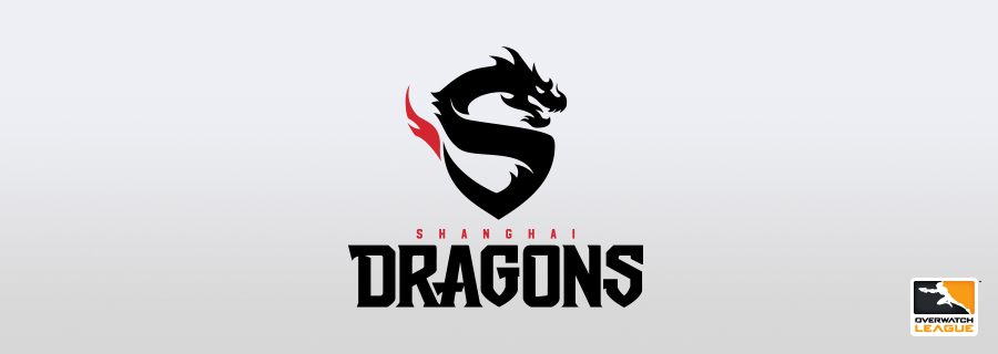
Another one that’s simple and effective. It’s a dragon in the shape of an S with a flaming tail. The logo expresses both the city’s location and the team’s name all at once in a way that most other logos haven’t.
2) Houston Outlaws

The black and green color scheme is alright, but it’s the way this logo speaks to many different facets of Texas that makes it a winner. The duel revolvers are all about the Outlaw name, but the way they come together to create a longhorn skull is what makes it special. Top it off with a star for the lone star state and you have a winner.
1) Seoul Dynasty

A black and gold, modernized tiger. It’s simple, yes, but it’s sleek, it’s sexy, and it evokes everything that a dominant sports franchise should. To throw around a term like “dynasty” deserves a logo that is equally regal, and this one is exactly that.


Published: Nov 2, 2017 03:28 pm