Design choices in League of Legends have always been a touchy subject for players, and things haven’t got any better today after Riot Games unveiled new and “improved” Mastery emotes that the game’s community already hates.
The new emotes, which Riot has added to League’s testing realm ahead of a wider release, have already drawn the ire of the fandom. One player shared what the new emotes look like in-game today and the unveiling was met with near-instant backlash; players say it’s an “ugly” design that looks ripped straight out of a “cheap mobile game.”
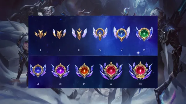
You may be wondering why they’re changing Mastery emotes when they were perfectly fine as they were. Well, Riot is introducing a new Mastery system, which means instead of being capped out at level seven, we can now continue earning points and level up our champion’s Mastery. This is a welcome new addition, especially for those who play a lot, but it’s pretty clear players still want the designs to cook for a little longer.
The near-unanimous roasting of the emblems saw them declared “super gross and tacky” by some, while others suggested they look like they came straight from [the] 2010 era of games—funnily enough, right around when League first launched.
The vocal fans aren’t wrong either. These designs look super outdated for where League has progressed to in 2024, with most barely fitting into the MOBA’s modern schemes. While they would suit any number of handheld games, or as one player pointed out may work for TFT or Wild Rift, they just don’t suit League.
The backlash has turned to begging as players ask Riot to stick with the old Mastery design and expand on it. However, that may not be simple to achieve considering how close to release the ‘upgraded’ designs appear to be.
Hopefully, these designs aren’t final because League players may begin to riot, especially after the most recent High Noon event pass debacle. Pun intended.





Published: Mar 25, 2024 09:44 pm