Fans love the augmented-reality Pokémon game, Pokémon Go, for a bunch of reasons. Some enjoy the rich and detailed lore of the game, while others prefer the battling and competitive aspects of it over anything else.
Then come the players who love nothing more than a well-designed Pokémon. But even the Pokémon that have been graced by the hands of a talented artist can easily fall victim to the wrath of a horrible Shiny design.
These distasteful Shiny designs are each bad in their own way, for different reasons. Some may be way over the top, while others can be simply lazy and uninspired. But at the end of the day, each of the entries on this list will make you sigh at the thought of missed opportunities, and really cool-looking Shinies.
Here are the top 10 worst Shiny Pokémon in Pokémon Go, ranked from bad to worse.
10) Machop

Machop, Machoke, and Machamp were all contenders for number 10 on this list, but Machop is the clear winner (loser, actually) on closer inspection. While this line of humanoid-Fighting-type Pokémon all have the boring, overused green color that The Pokémon Company loves to plaster its Shiny Pokémon with, they made Machop’s shade of green even worse, somehow.
With a dull, gangrene-green infecting this little fighter’s body, there is nothing pleasing or awe-inspiring to gawk at. Machop does evolve into Pokémon with more pleasant shades of apple-green, which is this Pokémon’s saving grace.
9) Mega Charizard X

A unanimous favorite among Pokémon fans around the world, Charizard has one of the coolest-looking Shiny forms out there, turning its bright orange body into a menacing black one that strikes fear into its enemies. Mega Charizard Y gets the same treatment, and why shouldn’t it? No need to fix what isn’t broken. And then there’s Mega Charizard X.
Sure, it wouldn’t make much sense to keep Mega Charizard X with a black color scheme, since its original design is majorly black as well. But they certainly could have done a better job with the Shiny coloration. The blue flames from its mouth along with the recolored moss-green body and crimson wings simply do not sit well on the eyes, and you don’t need a visual artist to tell you that.
8) Hitmontop

The original version of Hitmontop possesses an amazing color combination of milk chocolate brown and vibrant blue that effectively shows off this Pokémon’s energetic disposition which is further characterized through its constant dance-like movements in battle, being a Pokémon that practices the martial art form of Capoeira.
This entire idea is thrown out the window when you see Hitmontop in its Shiny form. The dulling of its brown into a sickly gray in conjunction with that gaudy pink really makes you either feel sorry for the little living top or just run away from it in fear. Just look at those dead eyes.
7) Latias/Latios
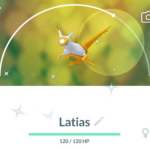
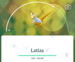
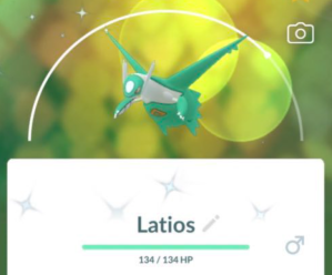
These twin Dragon Legendaries had a cool little complimentary design concept going on for them in their regular forms. Strong blue for the male Latios and deep red for the female Latias with the secondary white color decorating the rest of their bodies. This design is topped off with their eyes and a triangle on their bellies that possess the primary color of their counterpart. Cute.
Their Shinies? Not cute.
Latios has this green mint toothpaste color all over it and looks anything but fresh. Latias adopts this shade of yellow that pops out at the viewer in the worst way possible.
And now, while the color of their eyes and the triangles on their bellies still reflect the colors of their sibling, they fail to gel with the colors of their own designs and end up creating visuals that are simply unpleasant to look at.
6) Pikachu

Pikachu is one of the many Pokémon in the franchise that received the “subtle color change” treatment for its Shiny variant. While this may work for a couple of Pokémon, Pikachu certainly received the shorter end of the stick.
Turning from a pleasant light yellow to a warmer shade of yellow combined with lightened ear tips and its cheeks almost blending in with the rest of its body gives the mascot of the Pokémon franchise a very uninspired feel for its Shiny form.
Imagine implying its electric and bubbly personality through a white and blue color scheme that also lets Pikachu’s Shiny be unique and stand out, especially since it is the face of the franchise. A boring and bland Shiny form is almost criminal for a Pokémon like Pikachu.
5) Krookodile

Don’t we all remember first evolving our Krokorok in the Unova region and gazing at this badass, red-black gangster of a crocodile that looked like it would shred apart anything that comes in its way? And the colors of this Pokémon shifting from brown to a threatening red combined with the black stripes really made Krookodile frightening. No wonder it has the ability ‘Intimidate.’
And then its shiny comes in and ruins everything Krookodile stands for, with just a simple little, poorly-decided change. Shiny Krookodile’s primary color reverts back to brown from red, and it works well. The unforgivable part is changing its black stripes and patches into this ochre, sandy color.
This makes Krookodile look like an absolute clown (looks like we have a theme) and severely takes away from the edgy theme of the Pokemon. This change simply does not go well with the rest of its colors. Even keeping the black parts as they were would make it resemble its pre-evolutions while letting its cool factor remain intact.
4) Garchomp

There must be a lot of you expecting this entry on the list for a while now—and for good reason. Garchomp was the pinnacle of strength, badassery, and coolness ever since Pokémon fans encountered one in Generation IV, either through training up the rare Gible or through seeing Cynthia’s menacing Dragon/Ground-type beast in action, wiping out your team after you ran out of Max Revives.
Garchomp’s color design perfectly captured its concept of being a land shark along with its typing of Dragon and Ground. So what did they do with its shiny? They made the difference nearly unnoticeable, of course.
Garchomp’s shiny gets a minor change in hue, making it marginally more brown, with a “sandy feel” that can go completely unnoticed unless you’re squinting your eyes that are inches away from the screen. A real letdown.
3) Druddigon

Druddigon’s original design actually pulled off the stark difference that comes with a red and blue color scheme, and actually seemed like it meant business. Looking at its shiny form really makes you wonder what the angle on this shiny was supposed to be. If the artists wanted to turn Druddigon into a complete laughing stock, then I guess they did their job just right.
Its spiky and menacing blue wings, now colored green, simply look like leaves of spinach that no baby would put its mouth near; the rest of its body sharing the same green shade just overall makes it look like a plain vegetable. And the peach-colored head? What? You cannot take Druddigon’s shiny form seriously.
2) Lucario

Another very popular Pokémon whose Shiny potential was completely shoved down the drain. Lucario’s original form possesses a sleek and royal blue with a patch of yellow fur in the middle that gives a pleasing contrast to its look.
Its Shiny form inverts its color scheme in the worst way possible. Taking the yellow in the middle, turning it almost fluorescent, and then applying it as the Pokémon’s primary color was a horrible decision. The yellow fur in the middle is replaced with the main blue color, but made into this obnoxious bubblegum blue? Why?
Lucario turns from the coolest companion Pokémon you can travel along with on your journey in the Pokémon world to an oddly-colored canine that escaped from the local circus, and we can’t imagine players being very happy to even Shiny hunt for this otherwise epic Fighting/Steel type.
1) Moltres

Look up. There, in the sky. It’s a bird. It’s a plane. Wait, no, it’s Moltres. But why does it look like that? Oh right, it’s another bad Shiny design. So bad that it takes the number one spot on this list.
Moltres wasn’t the best design in the first place, simply looking like a malnourished flying chicken on fire. Its Shiny variant took that unsatisfactory design and turned it worse. With a body that looks devoid of skin and bright yellow-orange flames that do not complement it in any recognizable way, Shiny Moltres suffers thematically, and simply visually.
At least the artists made improvements when designing the Shinies for the Galarian forms of the Kanto birds, having Shiny Galarian Moltres adopt its Kantonian form’s original colors and actually making it work. We wish the same could be said for Shiny Kantonian Moltres.


Published: May 9, 2022 08:59 am