With the launch of League of Legends patch 13.17, summoner icons for all 165 of the game’s champions were added to the store. And while most of the champions’ icons look pretty solid, one is standing out in particular for being “bland” and “childish,” according to the community.
In a post to the official League subreddit earlier today, players voiced their displeasure with the Illustration summoner icon for Elise, claiming that it doesn’t fit the character’s personality and that her friendly look is not reminiscent of how she actually is in-game.
In the icon, Elise is sporting a pursed-lip smile, and her wide eyes make her seem genuinely welcoming and warm instead of sly and cunning like she actually is.
“She doesn’t even look like Elise,” one user said in the comments. “And when would Elise ever be smiling like that lol, so out of character. Looks like a cheap ass cosplay.”
What’s more is that the icon was changed slightly to make Elise’s eyes more open, her mouth closed, and her eyebrows more distant from her eyelids. These changes make the icon less intimidating and make Elise feel less like a villain, according to some League players.
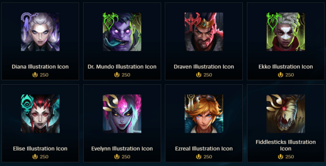
“Yeah it’s weird, she’s one of the very few champs who look cheerful in [these] icons and she’s definitely not one of those who fit in such a mood,” another player said in the comments.
While the addition of summoner icons for all 165 champions in the game is undeniably cool, there are some definite artistic choices that are leaving some players scratching their heads. And honestly, the misrepresentative theming of some of these icons goes well beyond the initial Elise example that was used in the Reddit post. Many other champions’ appearances in these icons don’t fit their respective themes, either. Ivern’s and Gragas’ also stand out as particularly jarring. In the cases of some other champions, like Xerath, you can hardly spot the resemblance.
These summoner icons have been in the store for a little over two weeks now, so it’s still pretty early into their relative lifecycles—meaning there’s plenty of time for Riot to make any artistic changes if they choose. Depending on how loud certain champions’ player bases are, we could see altered icons in the future, but I wouldn’t count on it.
Each of the Illustration series summoner icons are available in the LoL in-client store for 250 RP.

Published: Sep 17, 2023 11:29 am