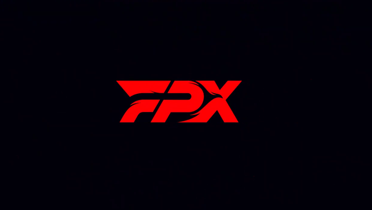
FunPlus Phoenix, the organization that won the 2019 League of Legends World Championship, presented its new and simplified rebranding earlier today. This isn’t the first time that the Chinese team has changed its logo, though. In fact, this marks FPX’s third rebranding in a little over a year.
“We’ve upgraded our brand vision from now on for all our divisions and franchises,” FPX said. “Our totem phoenix soars from oriental, engraved it’s burning mark rapidly on the letters of FPX. The vision we want to share is the spirit of Faith, Passion, and Xpossibility. Fly Phoenix, Fly.”
In this new logo, unlike the previous two, the silhouette of the phoenix disappears and becomes integrated into the typography, which has also been simplified to give the brand a look that’s more adapted to new trends.
The League community has had a mixed reaction to FPX’s new logo so far. Some people like this new image, while others have asked for the old logo to return with the org’s traditional phoenix.
As FPX said, this new logo will be used for every franchise and division of the team, including VALORANT, League, CS:GO, and more.
FPX recently played in the Demacia Cup, the main Chinese offseason tournament, where they were eliminated in the quarterfinals by the eventual champions, Top Esports. FPX adjusted its lineup for 2021, signing world champion Nuguri as the team’s starting top laner.
FPX’s new logo will debut with its revamped League team when the LPL begins in 2021.
Make sure to follow us on YouTube for more esports news and analysis.


Published: Dec 28, 2020 10:50 am