What is New York City? It’s five boroughs—Manhattan, Brooklyn, The Bronx, Queens, and Staten Island. It’s the city that never sleeps. The Big Apple. The city is bold, iconic, and fast-paced. It’s home to the Overwatch League’s New York Excelsior. Founded by Mets ownership group Sterling.VC, New York Excelsior brought on New York-based design firm Mother Design, which has worked on projects with Nike Golf, Reebok, New York Fashion Week, and the Philadelphia 76ers, to create the team’s identity. Most teams have some sort of tie-in to the city they’re located in: For Sterling.VC, New York Excelsior’s branding is securely fastened in city culture—Excelsior is the New York state motto, and it means “ever upward”—but still embraces Overwatch as an esport with its unique, playful design. New York Excelsior was one of the first seven teams to enter the Overwatch League—a new infrastructure model for esports. City-based teams make up the league, which is a first for such a large-scale esports venture. Twelve teams total are participating in the first season, with rosters spread across the world, from Shanghai, London, and Seoul to Los Angeles, New York, Dallas, and Boston.
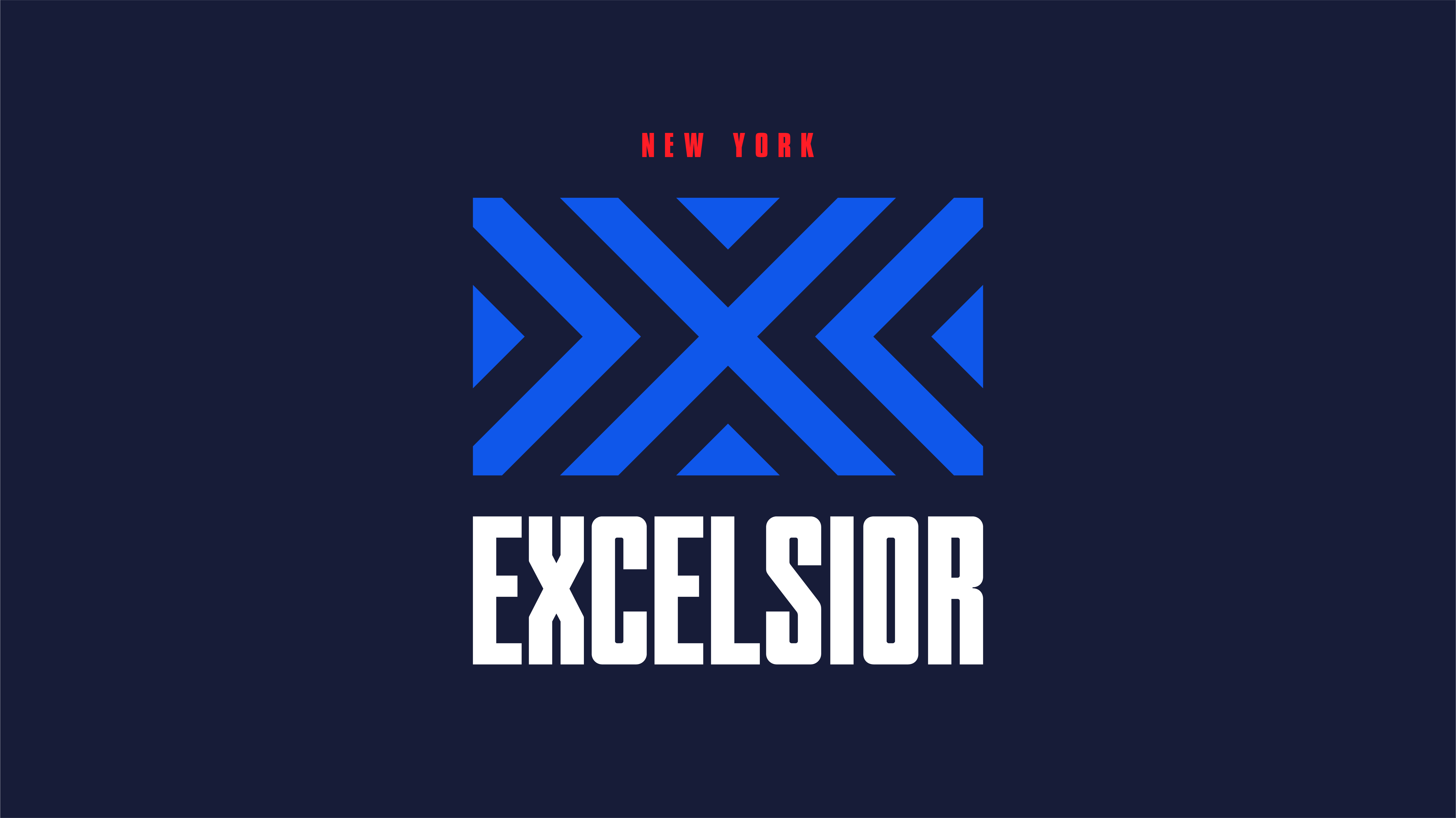
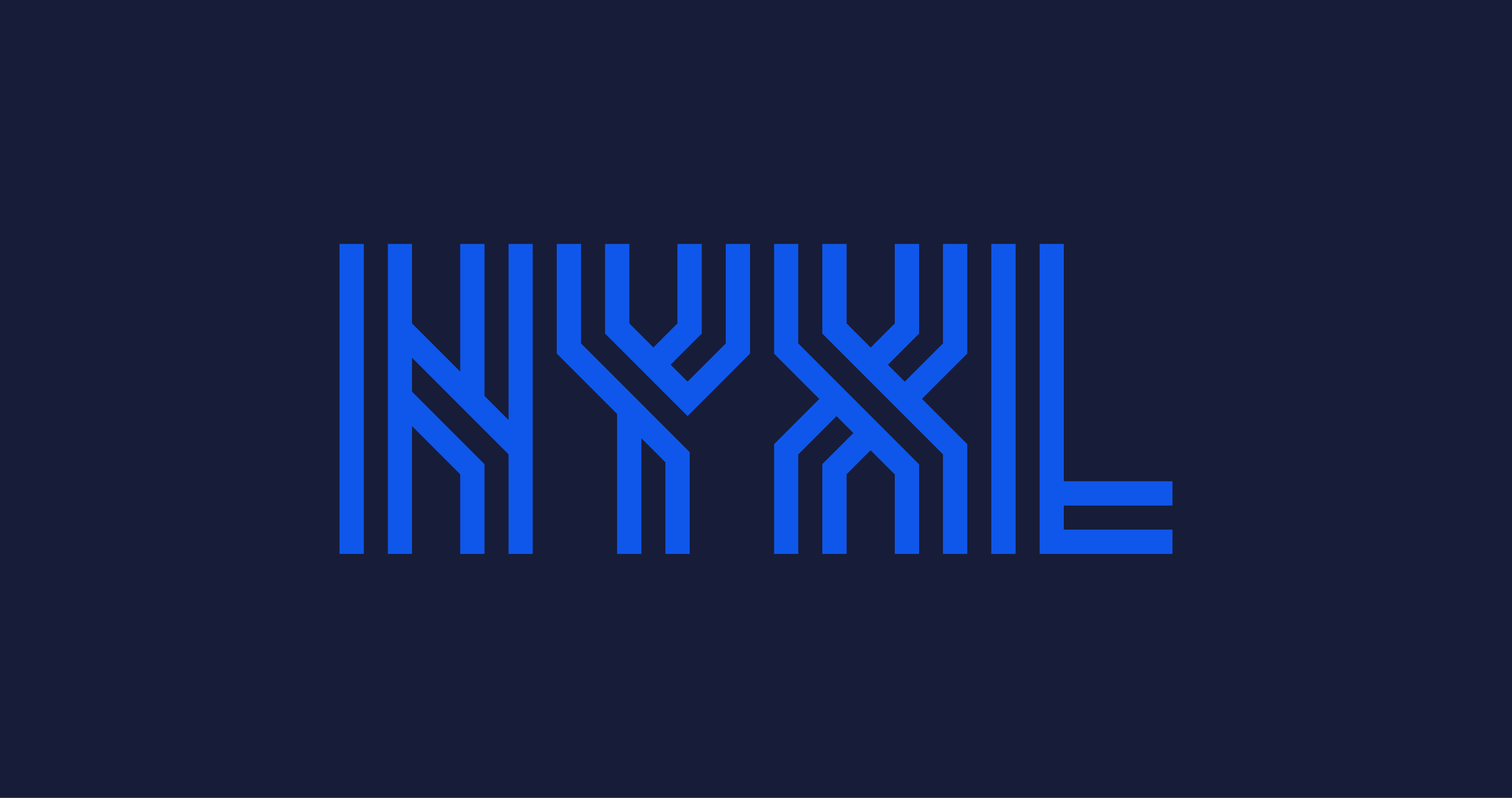
What Mother New York came up with is bold and design-forward, and unique in the pack of 12 franchises announced for the Overwatch League. On a midnight blue background, the logo is essentially a flag with electric blue lines. An X is in the middle, with chevron-like shapes forming two tilted L’s that sandwich the center, both of which draw the eye back toward the X. While other Overwatch League brands feature animals or cartoon-like icons, Excelsior is edgy, but not everyone in esports was ready for it. With a non-traditional logo—a flag—Excelsior stands out among standard sports logos. That’s the point, though. Mother Design insisted on planting the Exclesior flag “a little bit farther ahead” of the rest, a bit “more future facing,” Mother New York brand strategist Spencer Gervasoni told Dot Esports. NYXL speaks to New York as a place where everything is “bigger, badder, better,” Gervasoni added. “It’s the place where there’s bigger buildings, more people, more sports fans. It’s more attitude, more creativity, more of everything.” Each detail is intentional, even the lines that make up the NYXL logo. Mother New York chose the dynamism of the lines as a representation of New York’s city grid and subway map. New York is the movement of people and the current of energy that feeds into the city streets. It was a big source of inspiration for the design team. Related: Overwatch League franchise New York Excelsior has the most hype announcement yet “While designing the NYXL identity, we looked at a lot of reference[s] that spoke to the iconic scale and ambition of this city, but we were equally inspired by the ad-hoc texture that exists at street level almost everywhere you look in New York,” Mother Design creative director Jason Miller told Dot Esports. “The crosswalk markings, the construction barricades, the striped Con Edison steam vents. We saw it as a really powerful visual language that is almost poetic in its functionality. All of it led us to a story that is as much about ambitious heights and achievement as it is about boldness and the no-nonsense energy that drives this city forward every day.” Everything from the subway map and New York grid map served as inspiration; both are just such integral parts of the way New York ebbs and flows. “It’s such a constant thing. It’s this constant transfer of energy along all the lines, and we felt that bringing that to life in the logo really spoke to that,” Gervasoni said. New York is a city where anyone can come and prove they have what it takes to thrive, Gervasoni said. Each day is a little battle to take on, just like in Overwatch. Through it all though, Gervasoni believes there’s a “kind of everyday heroism” or “heroic optimism” that pushes forward life in the city and in the game.
It was the Latin meaning of Excelsior, ever upward, that drew the team to the word—coincidentally, it’s emblazoned on the New York flag, too. Now it’s the name of New York City’s Overwatch League team. Mother Design felt the name was “core to New York,” Gervasoni said. The heroic optimism of “ever upward” was appealing, and for Mother Design, that’s what defines the New York lifestyle. Not only that, but Overwatch is a game that’s continuously moving forward thanks to its evolving gameplay and regular updates. “It informs everything we did [for New York Excelsior], and we felt it planted the flag of New York in a way that really spoke to what Overwatch is about,” Gervasoni said. The name Excelsior and its abbreviation, NYXL, is really important to Gervasoni and his team, despite some backlash against the non-traditional formatting. “Some people seem to just want a plural noun,” Gervasoni said. “Even with the London team, Spitfire came out, and people were like, ‘Oh, it should just be Spitfires, with an ‘s’. Excelsior is more about an attitude and a spirit than it is about just a plural noun, like Rangers or Warriors.” With its design-forward logo, Excelsior is innovating in a field where other franchises stuck to traditional sports branding. Mother Design is trying something new with its Overwatch League design. “We’re excited to be on the frontier of pushing this, to not be afraid of behaving in a new way that feels kind of ownable and exciting and not just on a well-trodden path that sports have been on before.” With Mother New York, Excelsior is building a community that speaks to the “New York-ness” of diversity and influence coming together. There’s symbolism in the name and its logo that’s meant to inspire and drive forward not only the team, but the industry, too. Update, Nov. 29 at 10am ET: This article has been updated to clarify Mother Design’s inspiration for the project as the meaning of the word Excelsior.


Published: Nov 28, 2017 09:35 am