Street Fighter 6 was officially revealed late last night following the conclusion of the Capcom Pro Tour 2021 Season Final—though it was little more than a teaser trailer with the promise of more information this Summer.
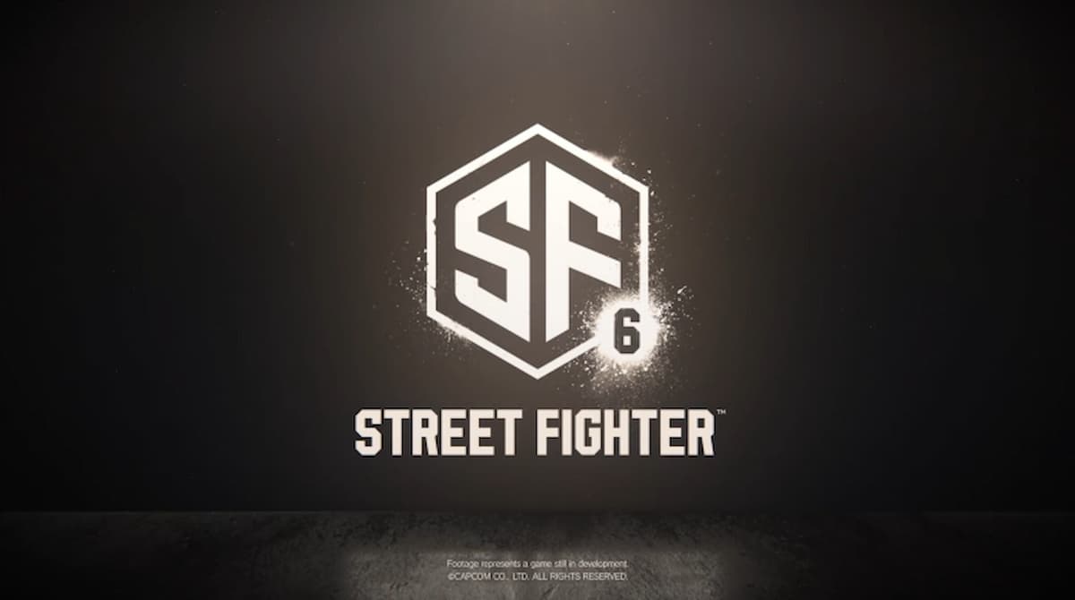
Because there is so little information to go on, Street Fighter fans and general gamers alike have been dissecting every aspect of the teaser, including the logo. The newly-revealed design takes a different approach than any other game in the franchise.
The sleek design with sharp edges and a lack of bright colors more closely resembles a modernized sport or fighting league’s logo than anything Street Fighter has used in the past. This has resulted in many fans calling it oversimplified and claiming it’s a decision that strays too far from the legacy of the brand.
In particular, the lack of color striking. Even when you take into account the mostly muted colors of the teaser trailer, the modern aesthetic doesn’t scream Street Fighter when you hold it up to any of the game’s past main logos. That comes from a mix of a rather bland font, the loss of roman numerals, and a general lackluster presentation without the initial animated splashscreen.
It also doesn’t help that graphic designer and avid Street Fighter enjoyer Aurich pointed out that a very similar product to the SF6 logo design is available for $80 on Adobe’s Stock asset library, along with several examples of conventions, businesses, and more using similar logos too. At worst, this could mean Capcom simply searched for a generic logo and made slight alterations.
With this ongoing discussion, which doesn’t even include the ones focusing on the game’s more realistic look based, many fans have started redesigning the logo. The attempts include efforts to better incorporate styles utilized in previous games, namely the brush strokes from Street Fighter IV and the roman numeral concept.
Capcom could very well have only used this logo as a placeholder for a trailer that is supposed to confirm the game is under development and details will be shared periodically. However, we won’t know for sure until we get more information about the game this Summer, which was teased at the end of the trailer.


Published: Feb 21, 2022 10:32 pm