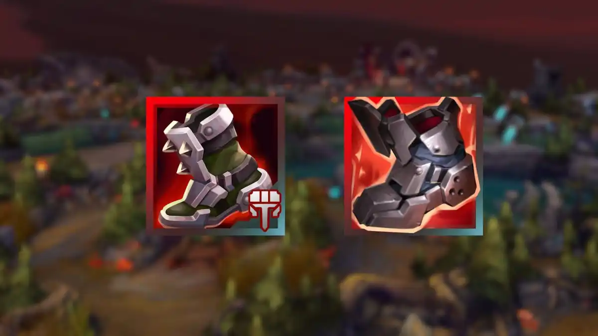
During the League of Legends preseason, changes comes often for many aspects of the game while players adjust to the new systems that have been put into place. But the community has voiced many complaints recently about the current look of all the item icons in the game.
Luckily, Riot Games has been listening closely to the concerns of the player base and will be making some much-needed updates to improve clarity for everyone trying to differentiate the various items in the shop and in their inventory.
When the first iteration of the new items dropped onto the live servers, many people thought that it was hard to distinguish the items from one another due to multiple reasons, including the number of details that end up crowding the design.
Other people also said the new designs weren’t made to be visually distinct, but more so to look pretty. These new effects don’t translate that well when sized down into the shop and into inventories, which also makes it harder to identify items quickly.
As a result, Riot will be making some changes to the icons. The devs will be emphasizing the silhouette of the item, while also reducing the amount of “noise” around the item itself.
There will also be a greater color separation between items so that players don’t get two or more items confused due to appearance. The polish that seemed to be applied to many items will be addressed in the upcoming patch as well.
These fixes aim to satisfy many of the issues that players have had from the first few days of the preseason. Colorblind players, for example, have had an increasingly hard time identifying items due to the color and design choices. This first batch of changes could alleviate these concerns moving forward through the rest of the preseason.
Make sure to follow us on YouTube for more esports news and analysis.


Published: Nov 17, 2020 02:21 pm