This article is brought to you by StatBanana, the best Dota 2 strategy tool.
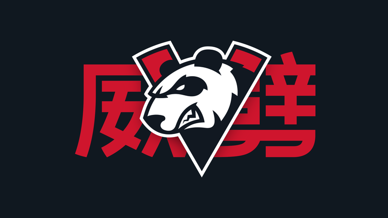
Ahead of the first International held in China, Virtus Pro has localized its visual branding and identity for Chinese audiences exclusively for the event.
The dominant CIS Dota 2 team revealed a specially crafted, distinctly Chinese rebranding strategy in collaboration with Russian design agency Quberten Design today on its official website.
Numerous design elements have been changed. VP will trade in its vintage orange for red, widely regarded as an auspicious color for the Chinese.
The Chinese Dota 2 community is well known for christening Western players with its own nicknames. VP has embraced them, printing the players’ Mandarin nicknames along with their actual IGNs.
The Chinese nickname for Virtus Pro is pronounced “Wei Pi,” which is roughly transliterated from the team’s common abbreviation. It translates to “mighty strike,” a reference to the team’s blitzkrieg playstyle, and has been incorporated into VP’s new logo.
“August is full of great news for us,” said VP’s general manager Roman Dvoryankin. “I hope that our players will show some great Dota play at the tournament as well. China is a strategic market for us, and we’ve tried to pay respect and attention to local traditions.”
This isn’t the first time VP has rebranded for TI. The organization did so last year in a partnership with Megafon, prompting its controversial colorway switch to green and purple. While that was a rebrand for the entire organization, the prominent Chinese design switch is exclusively for Dota 2’s TI9 event.
VP will head into TI9 with new jerseys and a chip on its shoulder, once again entering as hot favorites. Will they live up to their expectations or crash and burn before the top four again? The International begins on Aug. 15.











Published: Aug 8, 2019 9:29 AM UTC