A Diablo 4 patch on May 28 implemented a new, under-the-radar feature that means a very noticeable UI icon now appears to show materials players pick up—and it has swiftly divided the community.
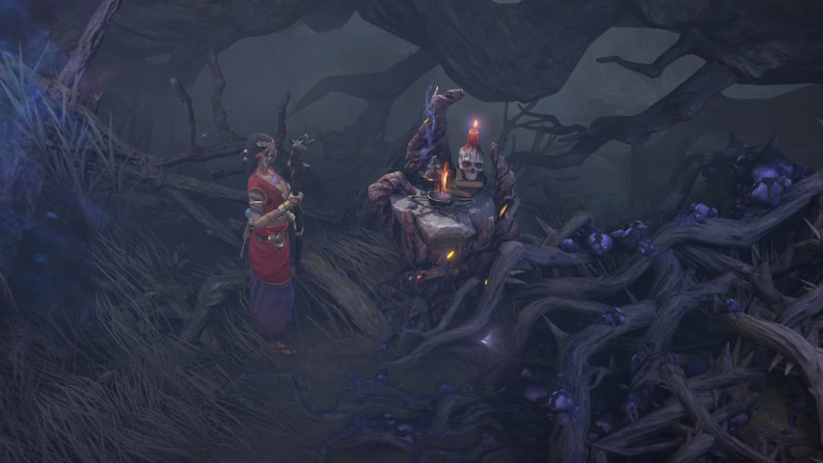
One player commented on a Reddit post about the unexpected change and how they felt it cluttered the screen for readability. They pointed out the nuisance of being shown non-essential resources. Flowers like Gallowvine, for example, which we gather a lot of for crafting, is one such material that pops up all too often on screen with this feature.
This feature was likely added to provide visual feedback to players on what they collect without having to try and scan tiny text with a magnifying glass to see what it is. For that reason, it further improves Diablo 4‘s accessibility, though the opposite can also be true since there may now be too much feedback for players. This led other unamused players to plead, “Let us have a toggle in the options menu!”
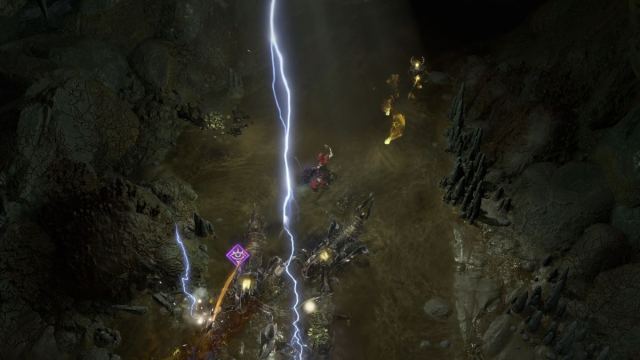
The feature itself was already in the Public Test Realm before the update release. and another player guessed it may have unintentionally gotten into the build, since it wasn’t thought of too highly.
That said, player opinions are divided, with people saying they don’t know “how this was never in the game” before, while others feel the feature looks “so out of place” and were even questioning if something was wrong with Diablo 4 while playing.
At the time of writing, there has been no comment from the developers about the fate of this feature, so, for now, we will be keeping track of just how powerful our flower-picking skills are in Diablo 4— whether we want to or not.






Published: May 29, 2024 11:46 am