The days of being unable to tell if Unstable Light is about to wipe your fireteam will soon be a thing of the past. Destiny 2’s finally revealed the extent of the UI rework launching with The Final Shape on June 4, including two entirely new areas dedicated to key modifiers.
Bungie provided a full breakdown of the HUD overhaul in today’s This Week in Destiny blog, outlining the fact Destiny 2 has “over 2000 player-facing buffs and debuffs” and could only display four at a time until now. The overhaul touches everything from how different buffs are prioritized to the readability of their icons, all while adding new channels at the top of the screen and above the Super meter focused on critical information and weapon-specific modifiers respectively.
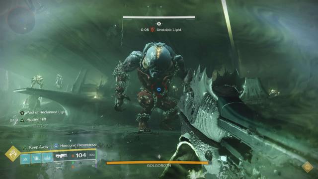
It’s a massive set of changes all at once, but ultimately vital quality-of-life improvements the game has sorely needed for a while now—especially in the wake of Light 3.0. As the developer pointed out in the blog, the limited system currently in Destiny 2 demands players “constantly juggle” a lot of information in their heads. While they still didn’t want buff displays to be overly intrusive, the need to show more of them and with greater clarity was clear.
The critical information area being added to the HUD will be by far the most important one for players routinely running endgame PvE content like raids. In The Final Shape, special mechanics like Deep Stone Crypt’s role system and wipe mechanics are some of the few examples of the modifiers that’ll now be displayed underneath the health bar. Bungie wanted such essential information to be in “prime real estate,” although it’ll only ever display two modifiers here at a time.
While the change to place weapon-specific buffs such as Kill Clip, Frenzy or Rampage just above the Super meter isn’t as crucial in life-or-death scenarios, it’s going to make it much easier to keep track of perk proc’s and Origin Trait uptime without those being crowded out by ability or activity modifiers. Like with the new critical information section on the HUD, this will also feature only two display slots.
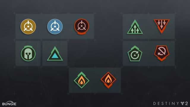
On a wider scale, buffs across the board have been given visual upgrades. Green buffs now have a thick line weight on the top of their icons to aid in clarity, especially for colorblind players, while red debuffs have a similar thick line weight at the bottom of their outlines. Any timers associated with the modifiers have now also been moved to the left side of the icons, making it easier to quickly read and take into account during hectic combat scenarios.
This alone is going to be a game-changer for Destiny 2 going forward, especially with the new ability-intensive Prismatic subclass to contend with, but Bungie is by no means stopping there when it comes to improving the UI and UX experiences.
“As many of you noticed, some footage shown on our April 9 The Final Shape Developer Gameplay Preview showed an in-development HUD channel that was on the right side of the screen,” they wrote. Despite feedback during development that it pulled players’ eyes to an “unfamiliar” part of the screen, they still want to evaluate the potential for including another channel like it in a release beyond The Final Shape.
For now though, there’s plenty to look forward to with the improvements coming to Destiny 2’s HUD with The Final Shape on June 4.






Published: Apr 11, 2024 02:37 pm