From Starfield‘s pesky Encumbrance mechanic to its lack of city maps, Bethesda’s new hit title saw its fair share of complaints following its release in early September. But likely none of the space RPG’s features received as much backlash as its tedious menu system.
One Starfield modder has taken matters into their own hands by redesigning the weapons tab of the inventory menu—and we’re hoping Bethesda takes notes.
When you go into your weapons menu, you’ll find a list of the guns you have in your inventory, but you have to click on them or hover over each individual option to see what ammo they use. This issue can greatly slow down gameplay in a title like Starfield, which has over 20 different types of ammo across its numerous weapon types. All too often, you may equip a weapon from the menu screen or quick-swap to another gun in the heat of a firefight, only to realize you’re out of the ammo you need for that weapon and have to go back to the menu to pick another option.
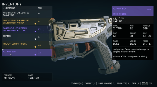
Reddit user Kraihe shared a screenshot from the StarUI Starfield mod to the game’s subreddit today. This mod reorganizes the inventory screen to show all item stats at first glance—a stark contrast to what fans actually got from Bethesda. Item masses and values are listed visibly from the screen for each item without the need to hover over every individual object, and you can see the required ammo and DPS for each gun in the weapons tab all at once, making selecting a weapon for any given situation much easier.
For Starfield fans out there who prefer this layout to the game’s original inventory screens, StarUI is available to download from Nexus Mods, a website that offers a vast range of mods to improve the user experience in games like Bethesda’s new hit RPG.
Modding has been a longtime staple in the gaming community, especially for RPG titles like Skyrim, Minecraft, and Grand Theft Auto V. Whether they’re redesigning combat, offering unique options for character creators, or improving frustrating UI features, mods and those dedicated fans designing them have created ingenious and fresh ways to enjoy games both new and old alike. And with Starfield‘s immense popularity predating its release, it’s no surprise modders have already started cranking out creations to customize players’ experiences with the space RPG.



Published: Sep 12, 2023 02:28 pm