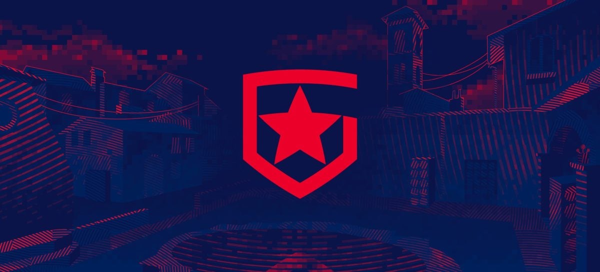
Russian organization Gambit Esports has a new logo as part of an overhaul to its entire brand identity. Gambit hired Russian sports design studio Quberten for the visual change.
The previous logo was a red shield-shaped icon with a star inside. Now, the shield resembles the letter G accompanied by the name of the organization with a matching font.

The branding of Gambit had to be changed because it “contained a number of serious problems,” including the “chaotic construction of the logo” and “the absence of the author’s star and shield,” according to Quberten’s case study.
The organization has a new overall visual identity and website, creating a unified look for the brand. The shade of red changed, there are new sub-logos, and the website will be better adapted to mobile as well.
“Our logo has barely changed since our organization was founded in 2013,” Gambit said. “New visual identity, developed together with sports design studio Quberten, will allow us to look fresh and up-to-date in a constantly evolving digital environment and will maintain a tight connection with Gambit’s legacy.”


Published: Sep 9, 2020 08:51 am