To celebrate the new competitive season, VALORANT fans are finally getting their hands on the long-awaited VCT team bundles in the shop. Every single supporter seems to be content with the new gear, save for the fanbase of one popular North American organization.
When the new bundles were finally revealed, Sentinels fans eagerly updated their VALORANT clients as they prepared to support their preferred team on the battlefield. Although most fans were happy with their favorite team’s bundle, Sentinels enthusiasts were met with what many fans are dubbing one of the worst player card designs of any VCT team bundle.
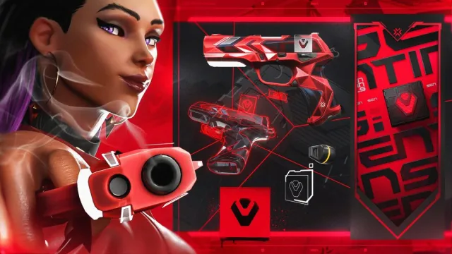
In the replies to Sentinels’ announcement post, fans voiced their distaste around the player card’s design, with one user saying that the team had the “most disappointing card by far.” Another fan even made a startling discovery after comparing the new player card with an old wallpaper on Sentinels’ website, and realizing that they had almost the exact same design.
Both the player card and wallpaper feature the Sentinels wordmark tiled across multiple times with a button-like logo near the middle, with minimal differences between. For a high-profile organization like Sentinels, it is relatively disappointing to see such an uninspired design for a card that will represent the entire org.
Luckily for Sentinels, they aren’t the only team that featured lackluster designs on their player cards, with teams like DetonatioN FocusMe, ZETA DIVISION, Cloud9, and Natus Vincere all getting some flack for simple logos on their banner.
They also aren’t being done any favors when compared to other teams like Paper Rex, Gen.G, Leviatán, KOI, and Team Liquid, who all leaned into a certain type of vision when it came to their own player cards. From majestic dragons to cute mascots, epic fossils, or ferocious tigers, these teams did not come to play with their designs, and it could net them new fans and even better profits this year.




Published: Feb 21, 2024 01:40 pm