VALORANT has been out for over a year now and in that time, the game’s user interface has remained mostly unchanged, inspiring creative players to come up with new ideas for the game.
In a recent post to Reddit, one VALORANT player shared their newly designed Agent menu screen boasting a League of Legends style selection tab and video ability previews.
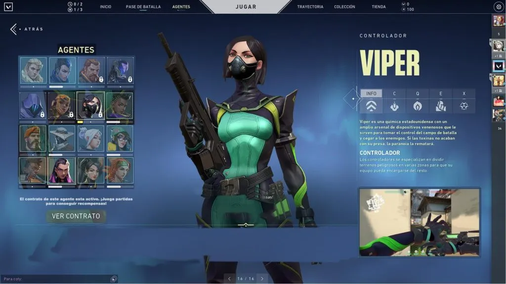
One of the reworked additions receiving praise from the community is the block-style agent roster. Right now, players are forced to scroll through a horizontal bar to see each agent. The feature hasn’t been without some criticism though. Many quickly began to question how it would work once the game introduced more agents. To this criticism, the designer Reddit user Mun192 shared that implementing a scroll function similar to what League uses would be all that is needed to fit as many agents as necessary.
The other handy feature that could benefit new players greatly is the idea of video previews for each ability that provides a look at how to best use them in-game. Right now, there are only written descriptions available for each of the agent’s abilities, but a video feed would provide further clarity.
While it isn’t a functional mockup as we’ve seen with similar UI functions previously, this design could inspire some inspiration from game devs for any future updates that could be implemented into the game.
As it stands there has been nothing announced regarding an overhaul of this menu within the game, however, with the community support, it could be a handy way to optimize things for players.
Make sure to follow us on YouTube for more esports news and analysis.









Published: Jul 27, 2021 02:47 am