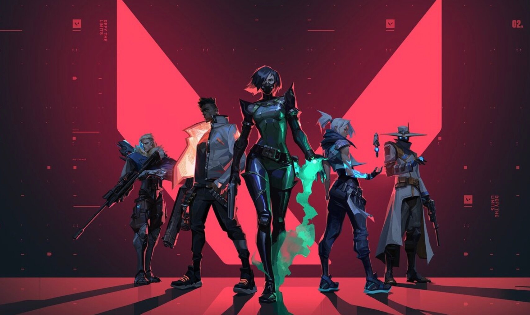
Since VALORANT’s release in 2020, the game has used the same agent selection screen. But one player is looking to spice things up by creating his own unique menu for the game.
User AYMANJBARI showed off a current build on the menu they had created using the Unity3D game engine.
Instead of a simple icon for each agent, players can see a larger shot of the agents, with a description of their strengths appearing on the screen when selected. Players can still see the other members of their team in a small window on the right-hand side of the client which also displays a top-down view of the map.
When replying to feedback from other users, AYMANJBARI shared that he will be working on a scroll function, so the screen can fit in more agents as they are added to the game. The coder suggested that it will work similarly to how the character selection screen currently functions in League.
This creation isn’t something that players can use within the client right now, and is simply a passion project born from boredom to revamp the selection screen. The whole creation took the user a single day to complete.
With the support this refreshed menu has garnered, it could inspire VALORANT to spruce up the selection screen in the future.






Published: Jun 21, 2021 02:07 am