
VALORANT’s Patch 9.02 has finally revamped the tac shooter’s agent select screen on PC to match the likes of its recently launched console version, and while the update does little to please players aesthetically, it’s certainly thrown instalockers with excellent muscle memory off their game.
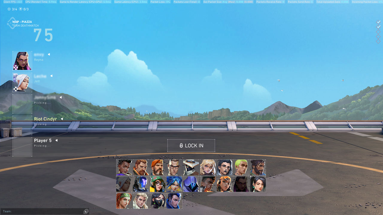
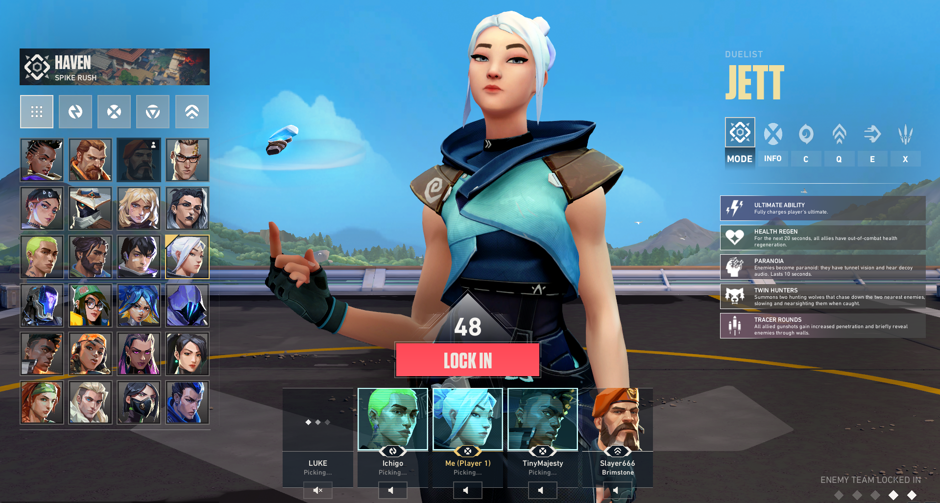
The patch, which went live on July 30, switches the position of the character roster with the team agent picks column while giving the agent select screen a more stylish look and feel. The update also increases the visibility of the map and mode names, as well as brings the enemy agent lock bar to the bottom-right of the screen. If you aren’t sure of the differences, feel free to take a look at the comparison below.
Unfortunately, while the update was intended to make things better, players aren’t convinced the new VALORANT agent select screen is anything to write home over. Some think the new design is “too cluttered” and “dark,” while many can’t wrap their heads around the scroll bar on the agent roster.
There are 24 agents right now in VALORANT, which fits perfectly in the new six-by-four roster block. While there’s no need to scroll to view all playable characters now, you will eventually need to scroll as Riot adds new members to the roster. “I hate scrolling down. It looks like shit, [I] have to click more before I can lock,” one disappointed player said on Reddit. “Straight downgrade in my opinion, the console select screen looks like shit and this is the same shit. Why the fuck does a preview of an agent model take up 60 percent of the screen?” another player added.
Why the anger? For most, the update undoubtedly hurts those who love instalocking their favorite VALORANT agents (looking at you, Reyna and Jett mains). Not only do they have to retrain their memory to quickly hover and select, but they may also need to use their scroll wheel to find their agent in the future.
It’s no wonder then that players who have been forced to fill for the team all this while are ecstatic about the revamp. They even had more ideas to make an instalocker’s life worse: “Put duelists at the bottom so you can’t instapick,” one player said. Another player went so far to suggest randomizing character positions every time, but while that may drastically reduce instalocking, it won’t be the best experience for everyone overall.
Personally, I love VALORANT’s new agent select UI—particularly because it was due for a visual revamp since forever. The features seem a lot more interactive and visually apparent than before and the fact that instalockers will have to put in some extra effort is just a cherry on top.
Then again, the scrolling experience may be a bit too annoying, so we’d have to see how Riot tackles it in the future before drawing a conclusion.


Published: Jul 31, 2024 01:51 am