Whenever the League of Legends World Championship rolls around, many teams break out some fancy new gear to commemorate the most important event of the year. From grandiose golds, raging reds, deep sea blues, and every color in between, many of these teams have brought interesting and unique spins on their original colorways.
There are, however, some jerseys that look miles better than their competition. These might not reflect what their gameplay says about them on Summoner’s Rift, but whether they’re turning up the heat or tilting off the face of the planet, they’ll look good doing it.
Here are our ratings for every special Worlds edition jersey at this year’s tournament.
MAD Lions
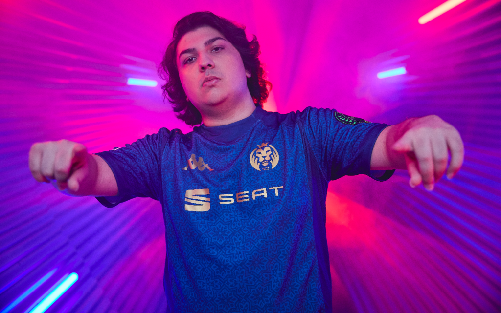
When MAD Lions revealed its Worlds jersey in the Royal Palace of Madrid, it was a unique and eye-catching presentation that wowed League fans across the globe, but the jersey itself was just as beautiful. The kit brings a unique twist to the original white and gold design, instead sporting an refined shade of dark blue with accents of gold from the logos, name, and number on the back.
Across the entire jersey, there is a subtle pattern that is reminiscent of the ceilings at palaces in Europe. It’s classic elegance we don’t usually see from an esports jersey, and it’s a refreshing change from the normal designs we’ve seen in the past in this industry.
The only slight that could be brought up about the kit is the choice of font for the number and name on the back. The team opted in for a classic font that matched with the sophisticated look of the jersey, but the problem with serifs like this is visibility. The player name looks a bit too small and thin in contrast to the massive number underneath, and can be lost when someone tries to read it from afar.
Rating: A
100 Thieves
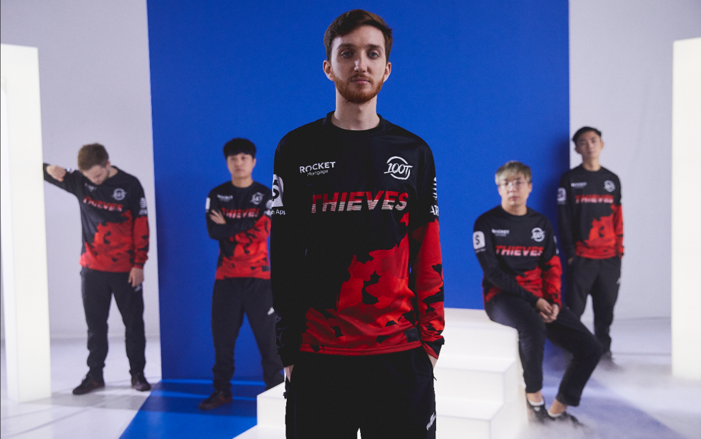
After a successful heist of the 2021 LCS Summer Championship, 100 Thieves are coming into Worlds with a new lease on life. The organization is also known for its popular merchandise and designs, and at this year’s tournament, they’re looking just as good as their summer performance with new jerseys.
The design isn’t vastly different from the jerseys they released during the regular season, which could turn away some people, since most of the design elements are in the same place. It is, however, still eye-catching, featuring the bold “Thieves” wordmark across its chest with a splash of red and grey camo around the bottom of the jersey and one of the sleeves. Compared to other kits at the event, this jersey brings some variety on a familiar silhouette and is one of the better-looking jerseys at Worlds.
Rating: B
Fnatic
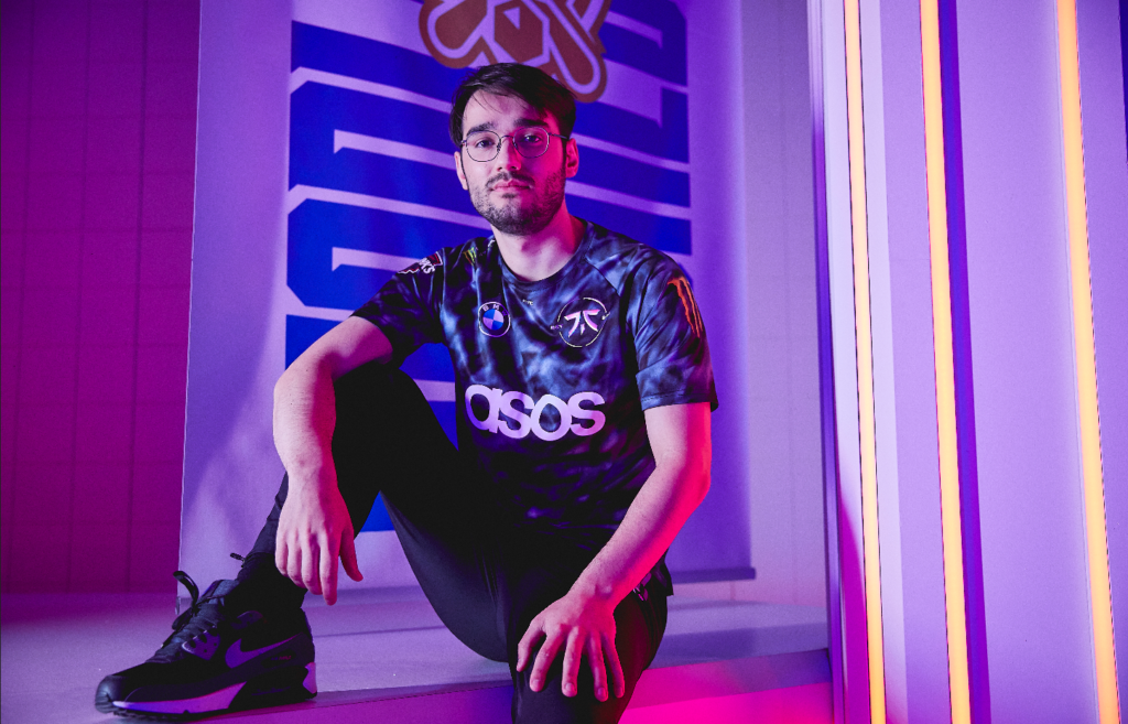
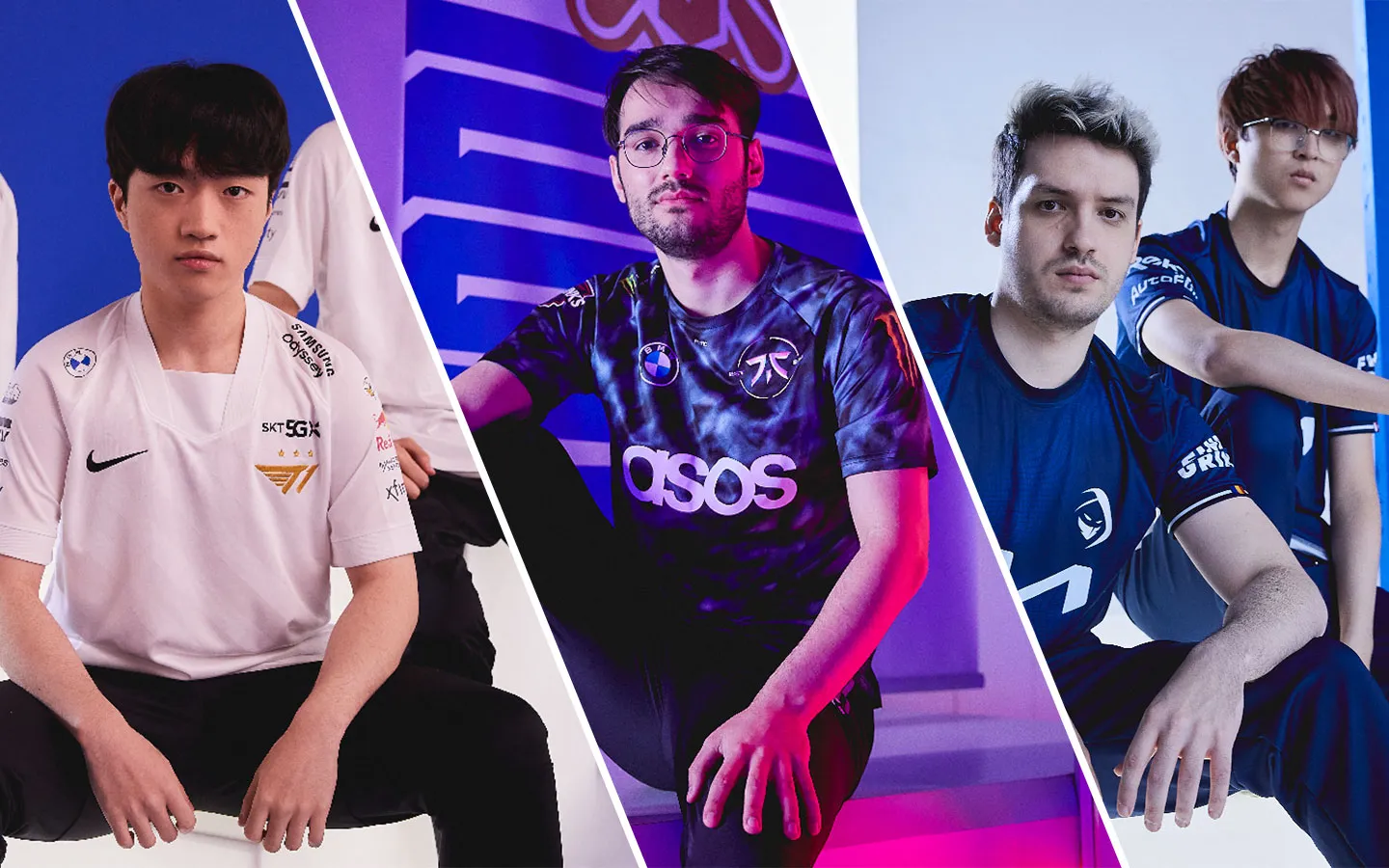
Praises to Fnatic for trying something very different for its Worlds kit. Instead of opting into its regular black and orange colorway, the org went for a monochromatic silver and chrome colorway from a majority of the logos on the jersey. The sponsored logo on the chest of the kit is ASOS, which is a plain white, but the Fnatic logo is a metallic silver that is also embossed.
The only issue that remains with this iteration of the kit is that it has too many similar colors, so it starts to blend a bit together at first glance. The logo stands out because it pops out from the fabric, but the jersey could have used a splash of color to help accentuate its details. If the logo had a classic Fnatic orange outline, it would help it stand out among the smoky grey and dark blue background.
Rating: C+
Gen.G
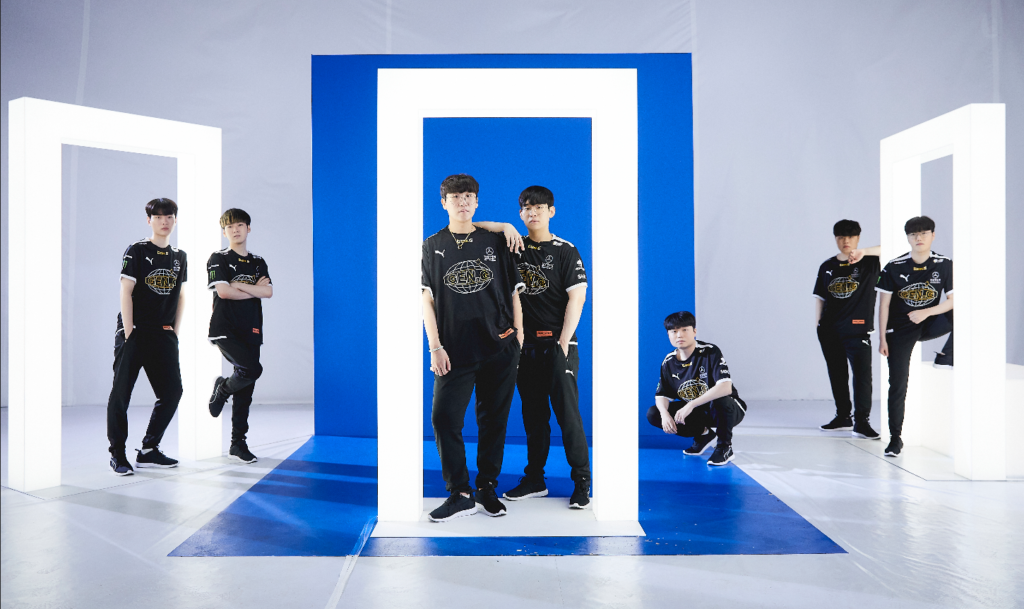
Heron Preston has once again thrown his own spin onto Gen.G’s jerseys, and it’s maintained its streetwear-inspired look from last year’s event. The kit has the team’s wordmark on its chest with a wireframe globe behind it, and is relatively simple to look at. It features gold detailing on both wordmarks and has a winged graphic on the back in white, grey, and Preston’s signature orange.
There aren’t too many eye-catching elements to the jersey since the colors and design choices were pretty tame, but the jersey does lean back into the “esports jersey” aesthetic more than its previous iteration. It also doesn’t help that the new logo looks very similar to NRG Esports’ old globe logo. Ultimately, these jerseys are decent, but not revolutionary.
Rating: C
Rogue
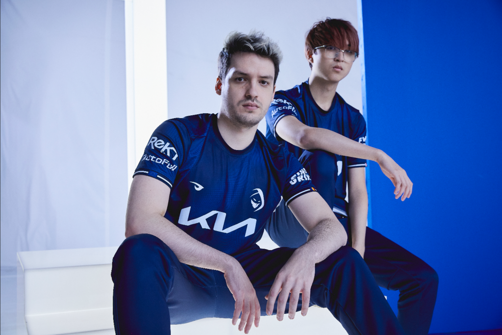
Many people love minimalistic design choices when trying out things in fashion. But sometimes, you can oversimplify to the point where there isn’t anything that stands out on the piece. For Rogue’s Worlds jersey, this was the problem.
The team decided on a much darker shade of blue than its regular season kit, which looks beautiful, but it also opted to remove multiple details from the jersey. They traded the Rogue wordmark pattern that spanned across the whole shirt for a subtle snake-skin pattern, which does look great but doesn’t catch your attention at first glance. The orange outline from the sleeves and the lighter blue collar were also removed, and instead were made into a darker blue with a white outline.
Like Gen.G’s jersey, Rogue’s kit doesn’t have any bad elements to it. But there isn’t anything that makes this jersey unique from the rest of the competition.
Rating: C
Team Liquid/Cloud9
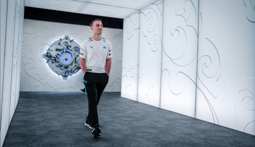
Both Liquid and C9 have been thrown into the same rating, and for good reason.
These two teams failed to change much for their jerseys, save for the fact that they flipped their color schemes in the design. C9 has been rocking very similar designs for its League kits since 2019, with the big C9 logo featured and the sponsored logos all in identical places.
The org flipped the script by veering away from the black and white, and instead landing on an almost all-white colorway of the same design with gold outlines on the logo. One cool detail that they did add can be seen on the bottom-third of the kit, where there is a pattern made up of the flags of all their players’ country of birth.
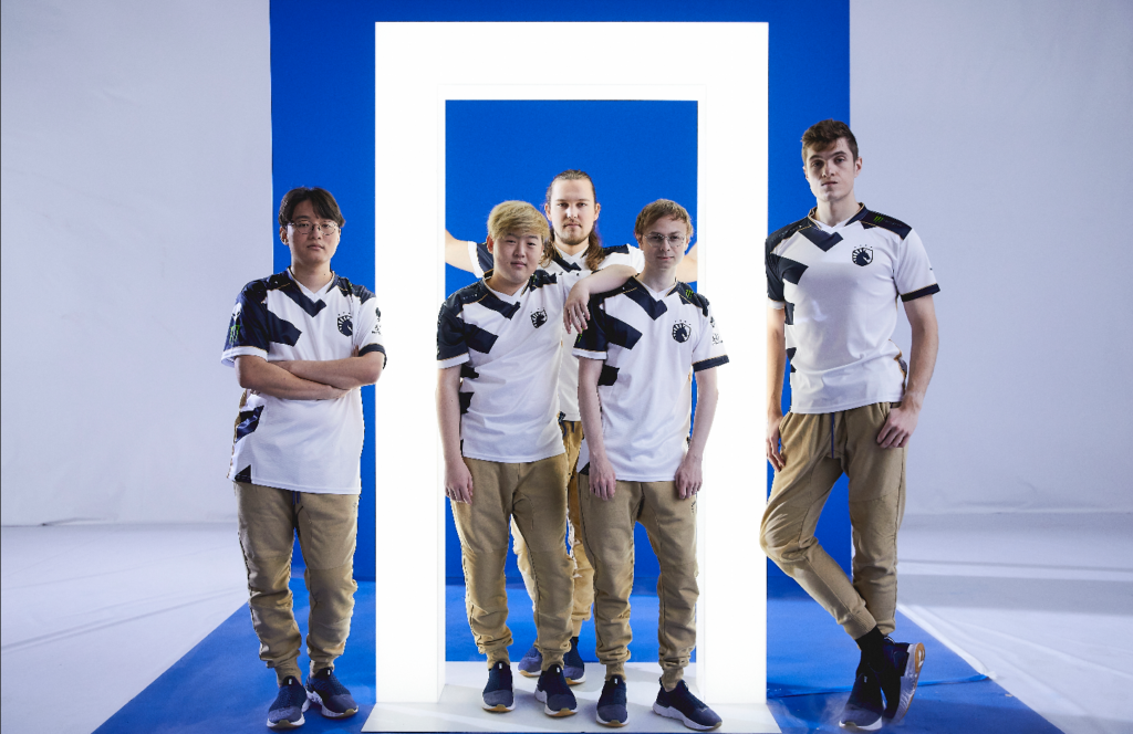
Liquid is even worse with its lack of creativity, however. All Liquid did was flip the colors on the jersey, so the blue area on the regular season edition is now white and the white area is blue. There aren’t any new details or design changes.
Ratings: D
T1
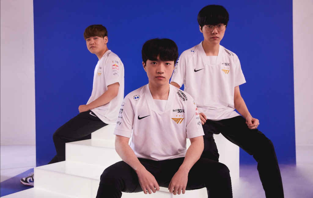
T1 might be the most iconic team in League history, but hopefully for the team, these jerseys are forgotten in the void right after Worlds ends.
If it wasn’t for the unique-looking collar, this jersey could be made by printing the team’s logos on a plain white t-shirt. Besides a barely noticeable striped pattern that spans across the kit, there aren’t any other details or designs on the jersey besides the team logo and the sponsor logos. Boring and uninspired.
Rating: F
Make sure to follow us on YouTube for more esports news and analysis.




Published: Oct 15, 2021 10:23 am