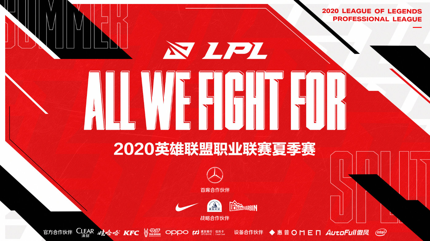
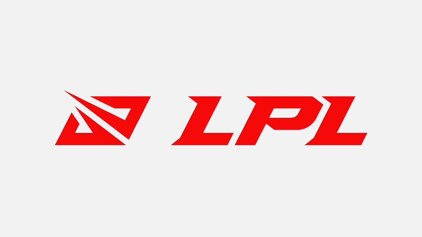
The LPL introduced Chinese League of Legends fans to a new logo earlier today. The artistic direction of the previous logo remains the same with the same colors and general form, but an impactful symbol was added.
While the previous logo took the simple form of Summoner’s Rift in red and white, this logo inverted the colors and displays two lines converging.
“Besides mimicking Summoner’s Rift map, the new logo shows the shape of two clashing together, symbolizing two forces inside the Rift clashing with each other,” well-known LPL journalist Ran translated from the official Weibo announcement. “And the clash is so powerful, that it begins to affect the world outside the rift.”
Related: All of the new LPL rosters going into the 2020 Summer Split
The logo is also meant to convey the image of the aggressive playstyle that the LPL is well-known for, as well as its evolving landscape of dominating teams and talents.
The previous logo was created in 2017 and didn’t change until today. The league has attracted many Chinese fans since its creation in 2013 but also more fans from across the globe since Invictus Gaming’s Worlds victory in 2018 and FunPlus Phoenix’s title run last year.
The LPL will kick off on June 5. Seventeen teams will fight for two months of matches to qualify for the summer playoffs and try to earn their spot at Worlds.









Published: Jun 1, 2020 10:50 am