Riot deployed League of Legends Patch 10.23 earlier this week, introducing a massive item system overhaul. But players are having a difficult time telling the difference between the new icons.
Riot revamped all the item icons for the preseason update, redesigning the weapons and altering the color schemes. A simple “item icons” search on the League subreddit reveals numerous complaints about the new shop, however. But one savvy fan made a few tweaks that they believe improve their readability, posting their recreation last night.
“The portraits have too much clutter and flair that, yes, while they do look very good on higher resolutions, that flair does not translate in icon form, making the icons seem busy and hard to distinguish from one another,” u/Rhazler said.
To make them more distinguishable, the fan removed excess colors from the background and upped the saturation of some hues. Others needed “heavy editing to make them look unique,” according to Rhazler.
The dark backgrounds create more of a contrast with the items, helping the shape stand out more. The updated Shurelya’s Reverie, for example, is easier on the eyes with a black background. Rhazler’s Locket of the Iron Solari also tones down the bright yellows so everything doesn’t mesh together.
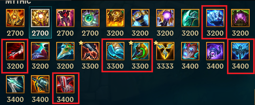
The new icons have been especially problematic for colorblind players. Several players with deuteranomaly, the most common type of red-green color blindness, told Dot Esports that the new icons are too detailed and use similar colors that blend together.
While Riot is busy hot fixing bugs and balancing champions and items, it’s unclear if it’s planning to improve the visual clarity of item icons.
Make sure to follow us on YouTube for more esports news and analysis.


Published: Nov 13, 2020 10:52 am