Epic Games introduced a new look for Fortnite’s main menu in the battle royale’s 26.30 update on Oct. 9, and players are far from pleased.
The updated design showcases game modes in large rectangular blocks with rounded edges, similar to streaming platforms. While it’s designed to be sleek, the Fortnite community sees it differently, drawing comparisons to smart TV interfaces and fast food app menus, and they’ve been very vocal about their disapproval.
One player described the new UI as “unbelievably bad.” Another went a step further, saying it was the worst user interface they’d ever seen, and that it felt more like browsing Netflix for a movie or show rather than diving into Fortnite.
It even inspired threads showing the new user interface photoshopped onto a smart TV; other words used to describe the look include cursed, disaster, horrible, and vile.
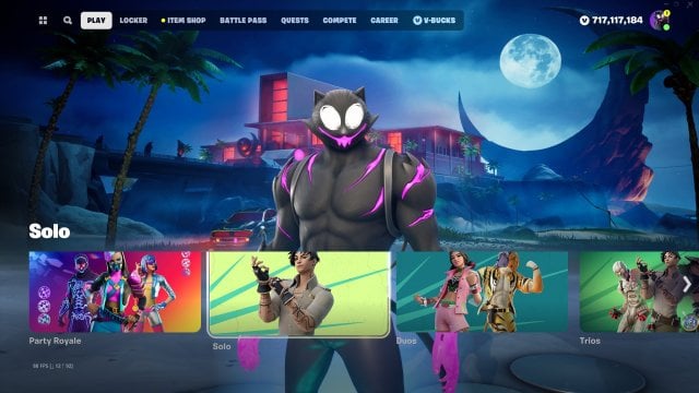
Beyond the look, many are frustrated with the functionality. Some say they are finding it harder to navigate, with essential features like the Battle Pass and Quests now trickier to access. It also was criticized for pushing players to play creative modes by shoving the discovery tab down people’s throats.
The general opinion was that the previous Fortnite interface was better in terms of looks and functionality, so why change it?
Some even asked who at Epic thought it was a good idea. While many players are urging Epic to restore the previous interface, they aren’t exactly optimistic about it happening.
As of now, the new design appears to be permanent. While Epic hasn’t officially confirmed that themselves, it remains to be seen whether they’ll adjust based on feedback or stand firm and wait out players eventually warming to the changes.
Either way, Fortnite players are adamant there’s a difference between an objectively bad user interface and a new user interface they’re just not used to.
Dot Esports has reached out to Epic to see if Fortnite’s new UI is staying.



Published: Oct 10, 2023 11:51 pm