PGL—the international tournament organizer that’s hosting the next CS:GO major in Krakow, Poland—introduced a new and improved version of the Counter-Strike: Global Offensive viewer interface, and its visual innovation is impressive.
The interface was being implemented just in time for the PGL American and Asia Minors, which both last until Sunday June 11. The PGL European Minors will be next week from June 15 to 18. The below clips from the Asia Minor compare and contrast the previous design style with the current style being used.
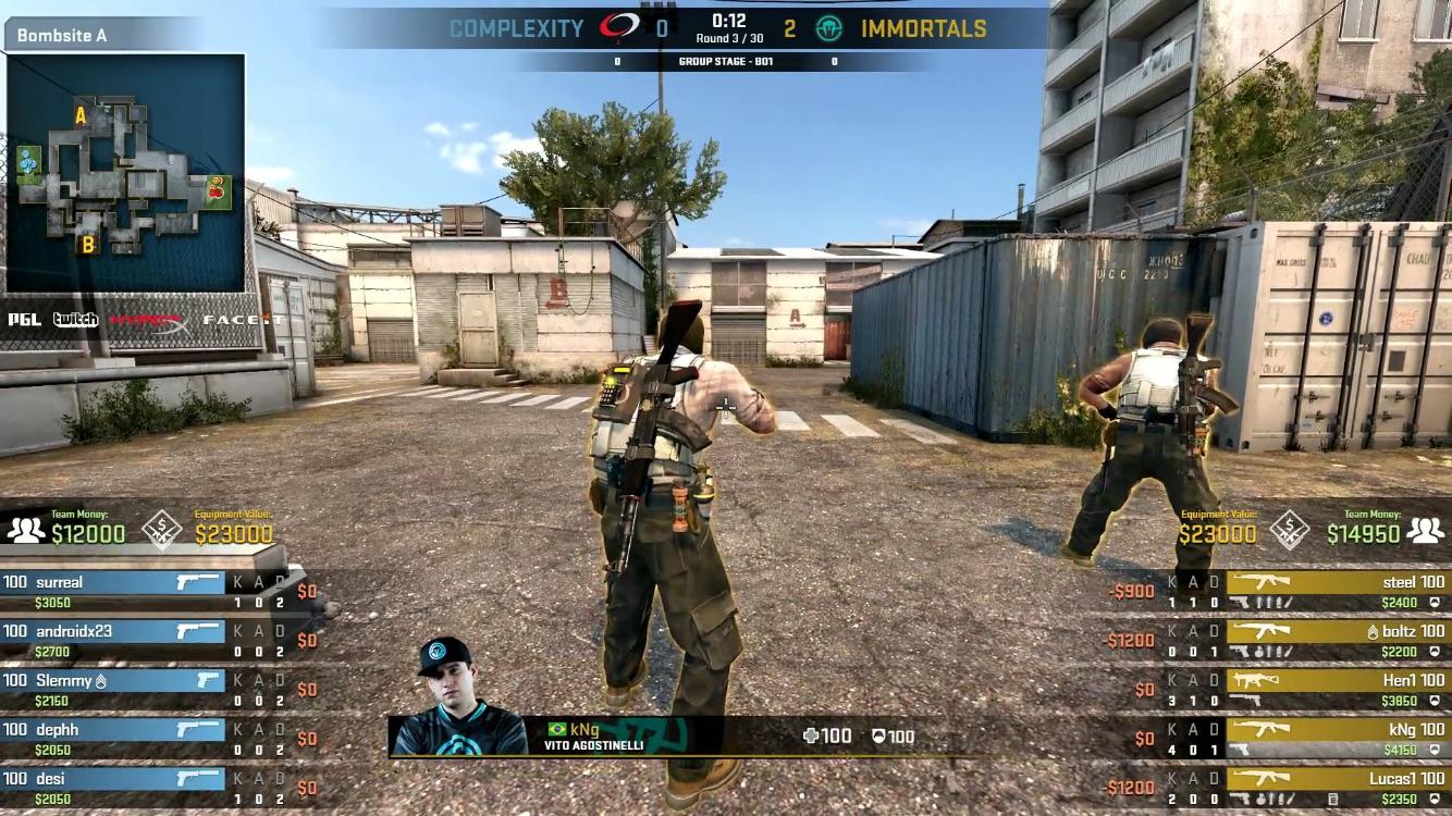
In the center of the screen, a player’s front profile with their country flag is displayed above their full name. The player being spectated also has their health, armor amounts, bullet amounts, and defuse kit displayed as well. These features were previously shown at the very bottom as part of CS:GO’s default user interface.
The biggest drawbacks of the new center style are the current weapon skin and championship pin not being displayed. Viewers will have to go all the way to a player’s Steam profile if they want to know what skin and pin they have equipped in-game.
The bomb plant/defuse bar and time can also be seen up to the hundredths place in the center when applicable, which is a huge change from the usual whole number time. This could definitely add tension to pre and post-plant situations.

The weapon, utility, health, money, and kill-death ratios are the same–but smaller–on both sides of the lower portions of the interface. The hidden easter eggs in this section are the insignia next to the in-game leaders’ aliases and the skulls denoting number of kills attained in a round. The newest additions to these parts are the “Team Money” and “Equipment Value” amounts, which are shown above each team’s in-game state.
Equipment Value, the monetary value of weapons and utility, used to be shown below the map scoreboard in a two-colored bar, but many viewers hardly knew what it meant. This change prevents that confusion. Team Money, a brand-new feature, tells viewers how well a team’s overall economy is in a given situation. If a team is poor or rich in money, viewers have a preview of what’s to come later in the match.
The team names, sides, and mini-map look more visually fleshed out too. The map has more detail, the names have a fully capitalized but different font, and the map series tallies below the logos are now actual numbers.
Overall, changes to the viewer interface are so aesthetically pleasing that it would be a welcome change if Valve added it to the CS:GO user interface.


Published: Jun 9, 2017 03:04 pm