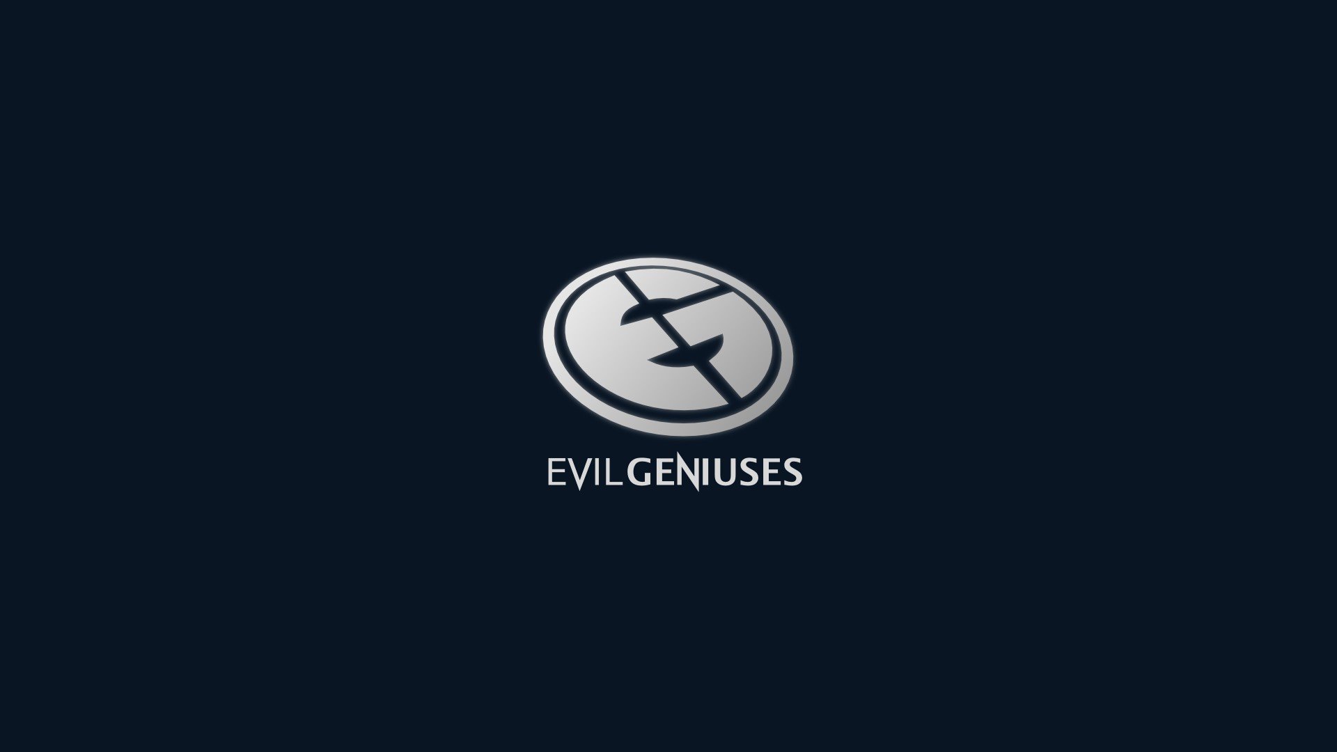
After 20 years, Evil Geniuses has changed its iconic logo.
Brands thrive on recognizable, appealing logos. It should be simple and easy to associate with the brand’s name. The esports world is filled with creative, eye-catching logos. From flexing mascots to contrasting text, esports logos have their own unique flavor. And EG, previously sporting a tilted coin-shaped logo, unveiled a new streamlined one today.
The new logo is sleek and simple. The brand’s name appears over a dark background in white letters. The new palette matches the company’s evil theme. The previous logo lacked the intensity of the new one. The original logo featured the company’s initials, E and G, in black lettering on a white background.
EG is a Seattle-based esports brand. The company was founded in 1999, according to its LinkedIn page, and prides itself on being one of the “oldest and most recognizable brands in professional gaming.”
It’s an unusual choice to change a 20-year-old logo and it didn’t exactly make fans happy. The new logo received a lukewarm reception. Comments on Twitter called the old logo “iconic” and accused the new one of being generic. Most of the responses were negative. Any that weren’t outright against the change were critical of the shift, though. Any positive responses were buried under the vocal majority.
EG competes in titles including League of Legends, Dota 2, CS:GO, Rainbow Siege Six, Fortnite, Super Smash Bros. Ultimate, and Dota Underlords.




Published: Dec 12, 2019 04:59 pm