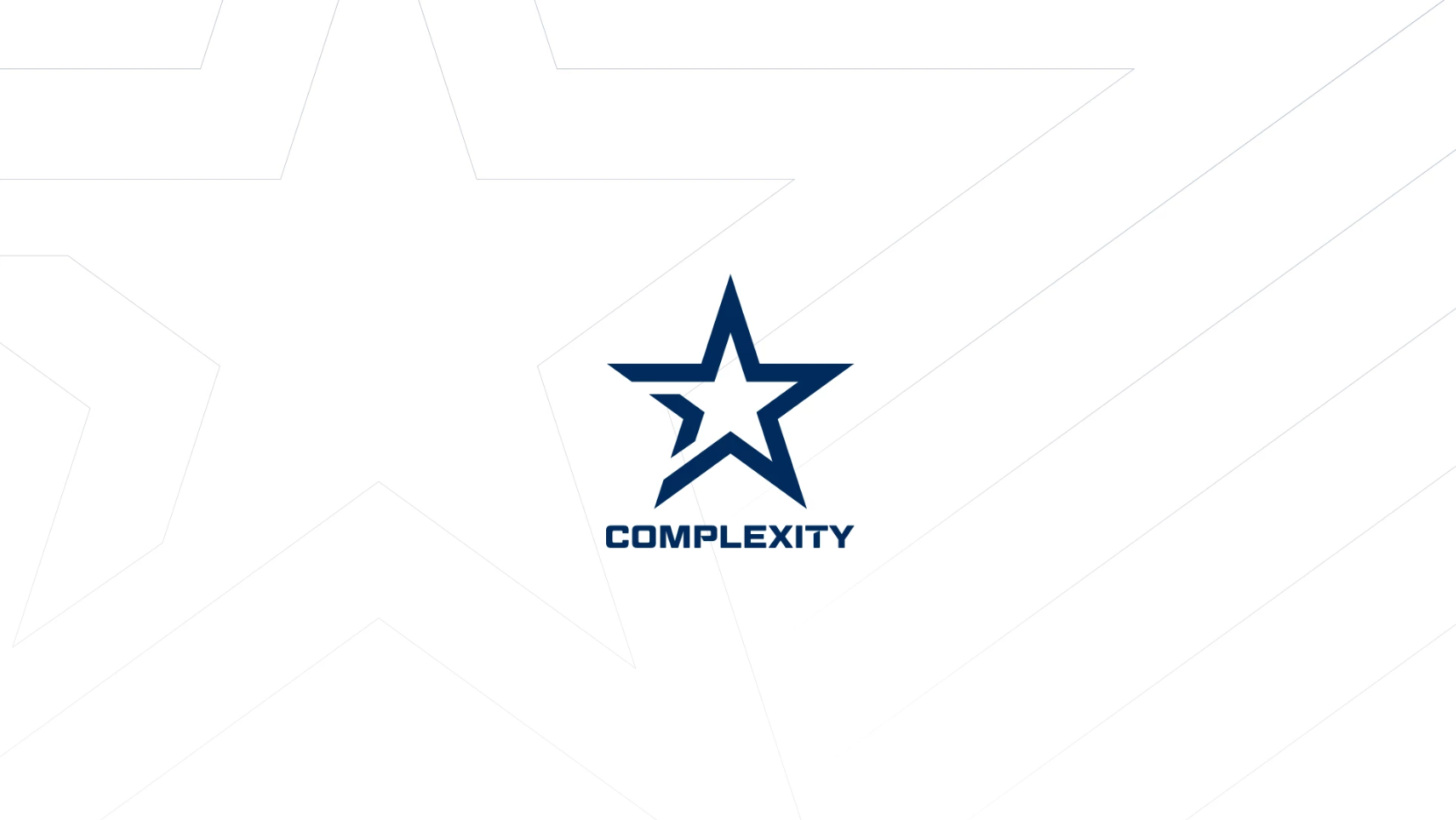
Complexity Gaming unveiled its new organization-wide rebranding today, including a new logo, website, color scheme, and company manifesto.
The esports organization will now boast a blue star as its logo—one that closely resembles that of the organization’s sister team, the Dallas Cowboys. Each point of the star represents one of the five Cs of Complexity’s brand pillars, or areas of focus within the esports industry: Competition, community, culture, cause, and convergence.
The rebranding serves as a push toward “Esports 3.0,” what the organization deems as a new era of the competitive gaming scene where professional esports players are treated like professional sports athletes. Complexity’s new manifesto “This is Our Game” focuses on inclusion, access, and support for the future of esports for both professional players and their fans.
“We’re not just changing a logo. We are building upon Complexity’s legacy as an innovator in the space by paving the way yet again,” said founder and CEO of Complexity Gaming Jason Lake. “This expanded vision takes everything we have learned over the course of the last 16 years as a premier esports organization and levels it up—setting a new standard and revolutionizing how esports organizations should operate.”
Founded in 2003, Complexity Gaming remains one of the most long-standing esports organizations in the industry. Although it’s most well-known for its Counter-Strike team, the organization owns teams competing across the esports spectrum, including Dota 2 and Rocket League.
Alongside its rebranding, the organization has released a set of merchandise items, including shirts, jackets, and jerseys, in its online store so fans can rep the new blue and white color scheme.





Published: May 3, 2019 04:11 pm