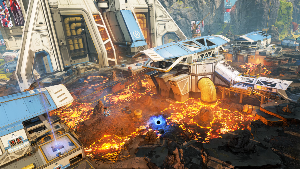
Alongside the introduction of Seer, one of the biggest changes Apex Legends made with season 10 was the complete tearing down of Sorting Factory, one of the most popular points of interest on World’s Edge, and the introduction of Lava Siphon in its place. Gone were the relatively one-floor buildings and train station that previously occupied the space in the south of World’s Edge, replaced with lava hazards, gondolas, and several multi-level indoor spaces with plenty of new combat opportunities.
And if you’ve ever wondered how game developers go about designing a change as large as this one, Respawn senior level designer Garret Metcalf has a thread for you.
In the thread, we get to go through some of the process of blocking out the new POI, as well as Metcalf’s thought process behind why some changes were made and some were not. Interestingly, there was originally no connections to the central tram station in Lava Siphon outside of the gondolas in an effort to incentivize people using the fast-moving suspended carts. That idea was scrapped in favor of giving players more ways to move around the massive central area. Other big changes include the downstairs area of the control room, which connects to the train tunnel behind the POI. The cavernous room we all know and fight through now used to be much narrower, with more individual rooms cutting off sight lines.
The texture-less block view gives a very clear look into how designers are thinking about combat and rotations throughout the POI, and it’s fun to see which ideas pan out before adding all the bells and whistles to make the map look good. Changes as simple as adding roofs to some walkways change the gameplay experience completely, since certain routes into and out of the tram stations are now far safer from the threat of enemies on high ground than they originally would have been. The interior rooms in the POI also got some major facelifts before a final design was settled upon.
All in all, it’s a very cool peek into the design process and just how many tiny decisions go into making a massive in-game area. With new maps and modes on the horizon, we hope to see the devs peel back the curtain more often on their designs and how they change the game we play.


Published: Oct 14, 2021 03:24 pm