Dead Island 2 is one of the most advanced zombie games that most players have ever seen, with systems naturally evolving alongside technology over the last decade. The game allows players to adjust how they view the world, choosing to hide or show icons to get a more immersive experience. But one change can improve your view without having to sacrifice much.
In the game’s settings, players can adjust a variety of icons that appear on the HUD to only appear when they’re useful. This cuts down the clutter on the screen. What’s better is that it won’t impact gameplay, since everything will still appear when you need it.
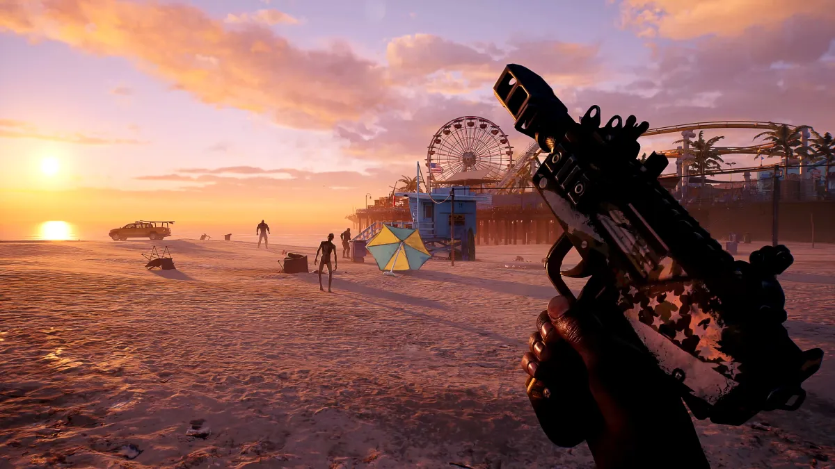
With a game as beautiful as Dead Island 2, you’ll want to see as much of the world as you can without an obstructed view. It will also help to have as much of your screen visible as possible so you can see the zombies when they inevitably come for you from every angle.
Related: All Dead Island 2 zombie types
What is the Dynamic HUD setting in Dead Island 2?

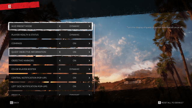
This Dynamic HUD setting causes certain icons on the map like your health status and reticle to disappear unless you use a weapon or you’re damaged. You can adjust the setting on the main or pause menu by:
- Go into the “Options”
- Go into “UI”
- Adjust the “UI Preset” to “Dynamic”
This will cause your icons to appear as they’re needed, and you can lower any remaining UI features as much as you want. At a certain point though, the game will warn you about how certain UI changes can affect gameplay. But some players may prefer this as it provides a much better view of the world.
If this setting works for you, another minimal change is to hide the quest objective information in the top right corner since this is one of the biggest pieces of information on the screen. You can also change this setting to “Dynamic” so it will only appear when you get around your quest icon. This will clear up an even larger portion of your screen.
Mess with the other settings to find visuals that are perfect for your experience.


Published: Apr 20, 2023 09:30 am