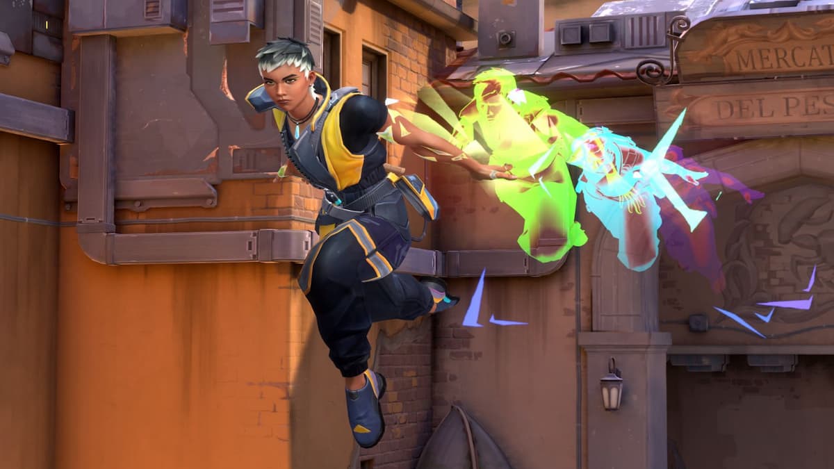
A massive update has hit VALORANT files, changing not only the battle pass, Act, and dropping in a new Agent (Harbor), but tweaking the title’s user interface too.
The October update was billed as an “upgrades” patch by the Riot Games developers, who hadn’t mentioned offiically that they were going to be mucking with the previous UI and UX. This new user experience (UX) has really only seen complaints since release.
It’s been a short period of time since the most recent VALORANT update hit live servers, and players were quick to voice their (mostly negative) opinions on the change.
VALORANT players flocked to Reddit to share their opinions. The /r/VALORANT subreddit saw thousands of people agreeing with the disappointing change, with the number of dissatisfied players continuing to grow.
One player wrote: “It really shocks me this actually got released in production.”
Others members of the VALORANT subreddit pointed out the clear push for fans to take their wallets over to the shop, with one Redditor saying, “Yea but they were sure to include the shop at the top.”

The new UX seems to make players navigate through menus more than before the VALORANT update was released on Oct. 17. Most of the FPS players questioned the reasoning behind this decision. One wrote, “Why force more clicks by having to go through “home” when it was all accessible before thru the top?”

Overall, players dubbed it a “downgrade” and praised the previous UX.

Riot Games has yet to respond to the backlash bubbling in the VALORANT fandom, and have given no indication if they’re going to roll the interface back to its prior state, or even ship a 3.0 version that addresses concerns.
If they do, Dot Esports will keep all VALORANT fans in the loop.








Published: Oct 18, 2022 10:13 pm