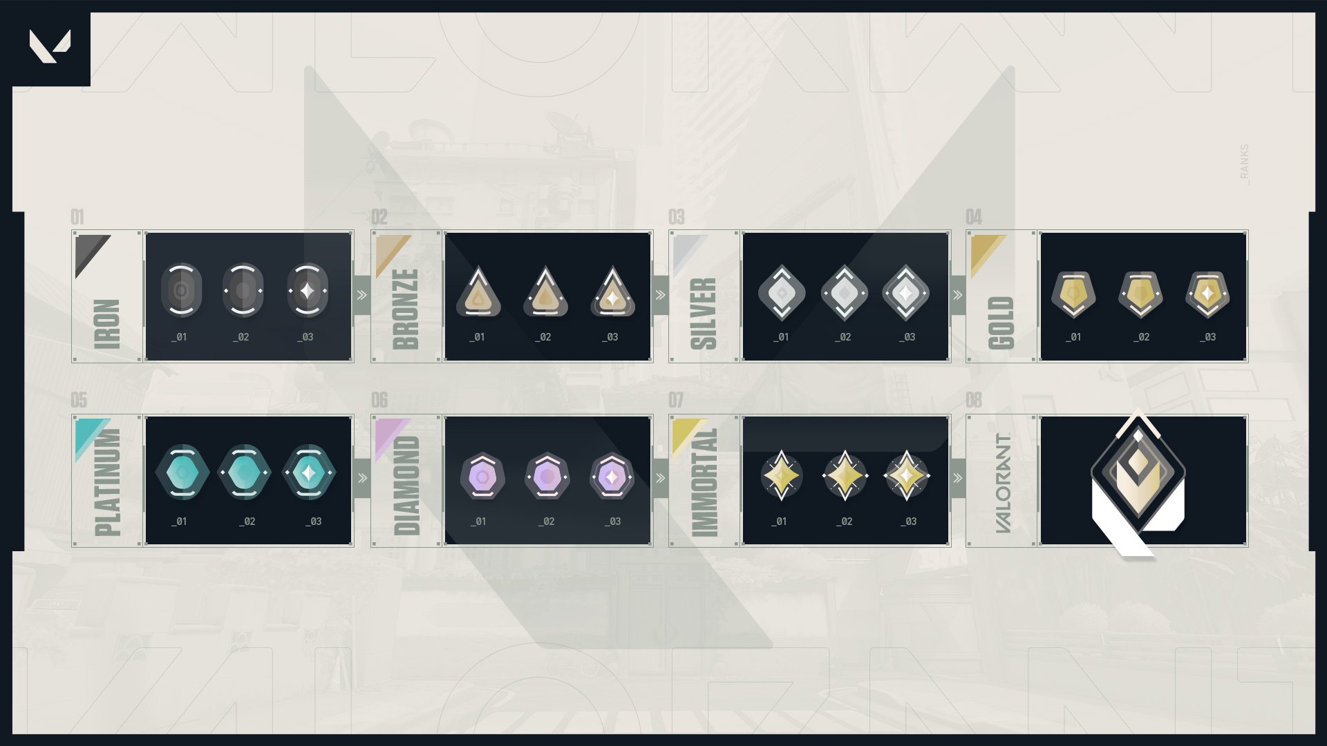
Riot Games unveiled a ranked mode for VALORANT last week, bringing joy to players who want a more competitive experience. But the ranked icons leave much to be desired.
A VALORANT fan, who happens to also be a User Interface designer, redesigned all the ranked icons with an intuitive and fresh look yesterday. The player used existing VALORANT imagery, such as the logo or ultimate charge dots, to create a user-friendly progression.
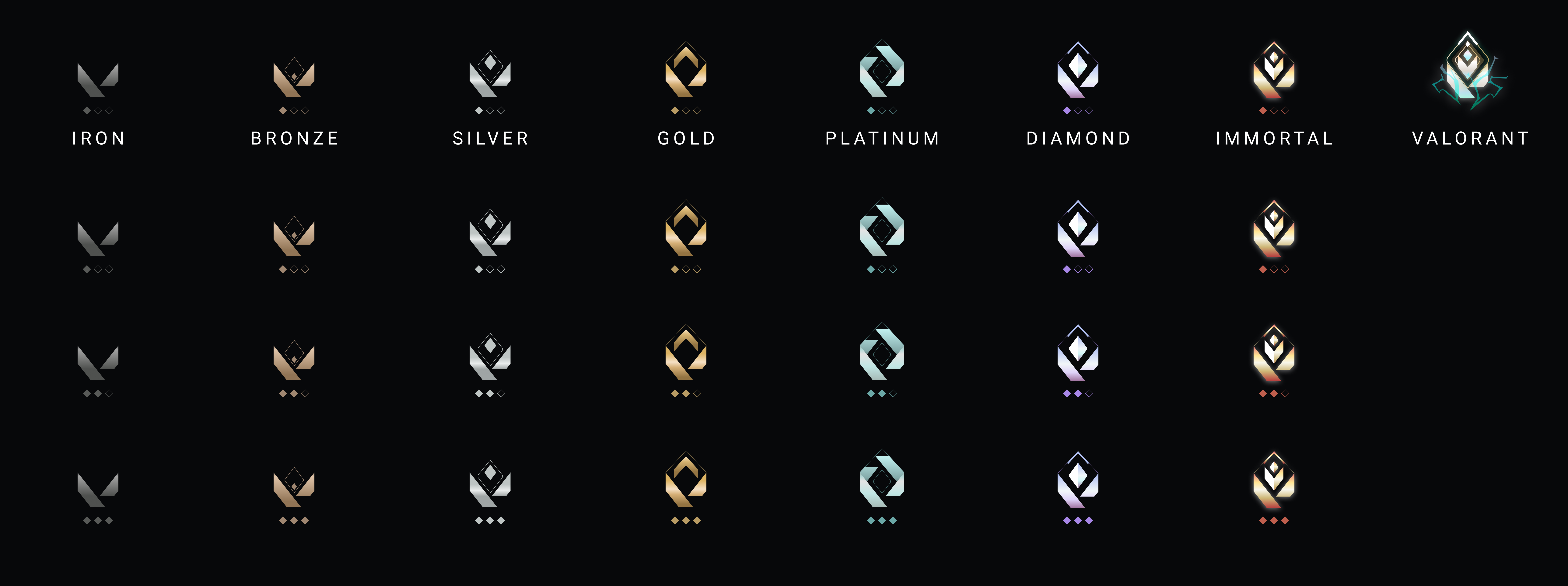
“My friends and I were very excited for VALORANT ranked, and disappointed when we saw the icons,” the fan said. “I felt the need to give the icons my own hot take.”
The fan felt the current silhouettes are “not distinct enough” and Platinum looks more like a “rusted copper.” They also said the coveted Immortal and VALORANT ranks “don’t feel powerful enough.”
To combat this, the designer made a distinct progression where each rank grows from the last one. The fan uses the VALORANT logo for Iron and slowly adds a more complex design and color palette for higher ranks. The VALORANT rank even includes some spark animation found on the loading screen.
The player also created a mockup of what it would look like in-game. Due to the clear design, the icons pop more in the post-game lobby.
Since VALORANT is still in its closed beta, Riot devs will likely iron out any issues before its summer 2020 release.



Published: May 5, 2020 09:39 am