Shiny Pokémon—they’re supposed to make you amazed and bewildered at the sight of them. After all, they’re incredibly rare, taking a regular Pokémon and giving it a completely different look. However, some of these different looks should have never left the drawing board.
Generation IX actually has a ton of amazing Shinies, so the few that are bad are nearly irredeemable, and you’ll be confused whether you should be pumped or disgusted if you happen to encounter these Pokémon on your journey through the Paldea region.
Here are the 12 worst Shiny Pokémon in Pokémon Scarlet and Violet.
The 12 worst Shiny Pokémon in Pokémon Scarlet and Violet
12) Armarouge
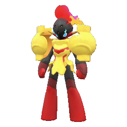
Woah, you got a Shiny Armarouge? That’s super sick. Well, what does it look like? Huh, we can’t really tell the difference. Oh, its eyes are blue—uh, is that it?
Yep, that’s pretty much it. The Shiny form of Armarouge just happens to swap eye colors with its counterpart Ceruledge. If you’re going for that, why not swap the entire color scheme at that point? A violet Armarouge would make for such an eye-catching Shiny—not to mention a yellow-orange Ceruledge—and would elevate this amazing Pokémon even higher than it already was.
The only plus point of this Shiny is that the change in eye color does go very well with the rest of Armarouge’s colors. It’s just the missed opportunities that land Armarouge on the No. 12 spot on this list.
11) Rabsca
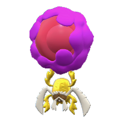
Rellor—Rabsca’s pre-evolution—had a brilliant Shiny concept. It took the dung ball that it prized more than its life and turned it golden, essentially letting it physically embody how Rellor saw it.
For Rabsca’s Shiny, the bug itself adopts the golden color that previously enveloped the dung ball, while the now psychic power-imbued ball remains the same. This leaves a very harsh contrast between Rabsca and its ball that’s just not pleasant on the eyes. That being said, we do think this is one of the more forgivable of the Shiny designs found on this list.
10) Squawkabilly

The thing that saved Squawkabilly from being a very forgettable bird Pokémon is the fantastic pompadour crest it sported on top of its head that would make Elvis Presley proud. We’re not too sure about the little hair coloring job it got done in its Shiny though.
Squawkabilly’s Shiny form turns the black crest on top of its head a light pink. This isn’t an incredibly horrid choice, but it certainly does not work in Squawkabilly’s favor.
9) Maushold
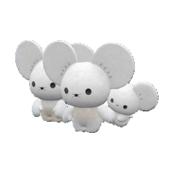
With everyone complaining about how newer-generation Pokémon designs are too weird, Maushold’s base design is refreshingly reminiscent of Gen I’s simplicity along with the signature quirkiness of Gen IX. That being said, they could have tried just a little harder with the Shiny version of this mouse family.
If you don’t look close enough, you may not even notice that regular Maushold has little gray “clothes” that it wears, either as a shirt or pants. In the Shiny version, these gray clothes turn tan, but it’s barely noticeable.
Another case of a Shiny where you can’t even tell the difference. Why not turn Maushold’s primary color gray or black and have its clothes be white? That would even make sense since mice do come with dark fur.
8) Paldean Tauros
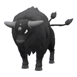
And here it is, for the nth time in the Pokémon franchise, another Shiny which you need to analyze closely before you can find out what the difference is from the original. Game Freak does not seem to be stopping this trend anytime soon, so we might as well get used to it at this point.
Paldea Tauros simply turns slightly gray, and on just a little patch of it towards the top side of its mane.
It’s not like it’s a Shiny that’s hard to look at because the colors hurt your eyes. It’s just a super lazy design choice, and in a way, that’s worse than a bad-looking Shiny. At least the latter tries.
7) Roaring Moon
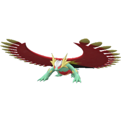
Salamence’s past Paradox form is probably one of the most daunting and coolest designs we’ve seen in a while. Why would anyone take that and turn it on its head to make it look like a clown is way beyond us. But Roaring Moon’s Shiny, unfortunately, does just that.
Just like the two other past Paradox forms on this list, Roaring Moon also adopts these sickly, pukish colors instead of the awesome blue and black coloration that it boasted in its regular form. You can make a Shiny wacky but still admirable without making it look straight up unappealing, but a lot of these past Paradox forms—just like Roaring Moon—seem to miss the mark on that front.
6) Scovillain
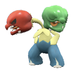
As if making the first Grass and Fire dual-type Pokémon in the franchise a flop of a design wasn’t bad enough, they went ahead and gave Scovillain a very disappointing Shiny as well.
What was the point of just changing up the colors in its torso and legs? And that too wasn’t done very well; the dull yellow and blue looks a little too odd when juxtaposed with the rest of the design’s colors.
Mainly, why not just switch up the colors of the heads? That seemed like a very obvious change for the Shiny version which could have given Scovillain some redemption in terms of design, but no. This Pokémon is apparently just a miss all around.
5) Houndstone
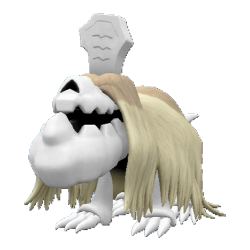
This undead dog normally has a neat design and color scheme. The only way you would easily pull off a good Shiny for Houndstone is by going for something drastically different, but its actual Shiny instead goes for a subtle change, and it fails to make any sort of a good impression.
Houndstone’s fur turns from a ghostly white to a dull gold shade which simply looks underwhelming, with the fur at the roots turning slightly darker. Houndstone normally pulled off the “ugly-cute” aesthetic pretty well, but with this Shiny, the ugly portion has skyrocketed much further than the cute portion, unfortunately.
4) Quaquaval
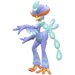
Quaxly—and also Quaquaval—has been the least popular starter choice among the three in the Paldea region. There was a chance for Quaquaval to redeem the Quaxly line, but its regular design certainly wasn’t the best it could be. To add salt in the wound, its Shiny is even more disappointing.
Quaquaval’s Shiny form has the very same colors as the regular form, just a lot less punchier. Game Freak really turned the saturation down and called it a day. Quaquaval needed some redemption after receiving consecutive blows from a design standpoint all through its evolution line, but unfortunately, this groovy duck seems to be doomed to mediocrity.
3) Great Tusk
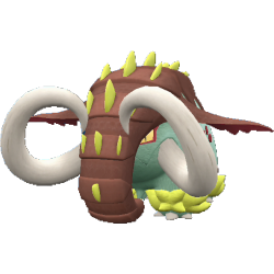
The point of Donphan’s past Paradox form is too behold this magnificent beast and bask in its glory. It’s large, it’s grand, and it will leave you in awe. The regular version of Great Tusk at least. The Shiny version, on the other hand, is a different story.
Everything turns ugly. The foreboding gray tone plastered over most of Great Tusk’s body gets a nasty green tone while all the spiky structures on its body turn pasty yellow, and the two components have a really odd contrast with each other that almost makes our eyes bleed, apart from being individually pretty questionable choices too. A real disservice to this magnificent beast.
2) Flutter Mane
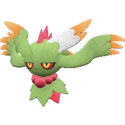
Replacing the dark green that covered most of Flutter Mane for this lighter, pukish green was far from a good idea. And then comes the tips of Flutter Mane’s titular mane. While yellow-orange is a pleasant color, it contrasts horribly with the light red and questionable green.
Game Freak really said “let’s take the intimidating-yet-appealing color scheme of Flutter Mane and replace it with the most horrendous colors ever.” No, we don’t think the cringeworthy colors resembling things that we’d rather not name make for a good Shiny. It makes for one of the worst Shinies, but there still happens to be a Shiny more despicable than this one.
1) Grafaiai
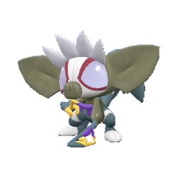
We’ve never really gotten an aye-aye Pokémon before, so we didn’t really know what to expect from one. But then we got Grafaiai, and it certainly didn’t disappoint. Aye-ayes aren’t the prettiest animals, and Grafaiai illustrated that well, all the while making the design cool and coherent. The same cannot be said for Grafaiai’s Shiny version.
It really feels like the colors were chosen at random and splashed onto different parts of Grafaiai’s body, because they do not make any sense and just don’t look pleasing together. Grafaiai’s face has this super light lavender shade which directly shifts to a jarring muddy green shade for its ears which looks very out of place, especially with the different accents of purple and red splattered all across its body.
We cannot imagine someone coming across this Shiny and being thrilled about it simply because of how ugly it looks, and how there are over a hundred other Shiny Pokémon that actually look good. For all these reasons, Grafaiai takes the No. 1 spot on our list.



Published: Dec 11, 2022 02:18 pm