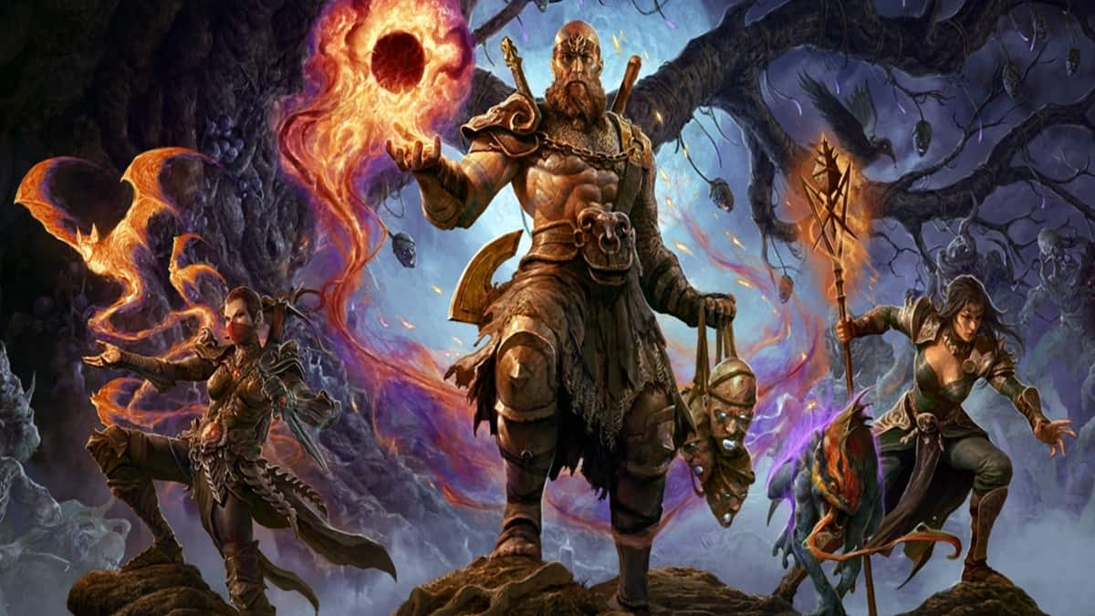
The discussion around Diablo 4’s user interface is continuing on the game’s Reddit page, this time surrounding the inventory screen in the game when compared to the previous title, Diablo III.
A Reddit user posted a side-by-side comparison of Diablo 4’s inventory with Diablo III, and many players were in agreement that the last game’s UI was more detailed and accessible.
The Redditor, Fearlessmojo, even had some suggestions for the UI in the new game, saying that it “may be more beneficial to completely remove ‘Currency’ and ‘Core Stats’ from the top of the character sheet details to make room for the more detailed stats that players often seek.”
Diablo III’s UI was more detail-focused, offering numbered statistics on offense, defense, and life, including such stats as elemental damage increases, bonus damage to elite enemies, and a lot more.
“I like the structure of D2 and D3‘s equipment screens so much better,” said one of the commenters in the thread. “At a glance you know which items are in which slots. Where as in D4 everything has equal weight, and you have to look through the image to know what is what. Its like they got no feedback whatsoever in their design process.”
Another commenter was quick to claim that Diablo 4’s character-centric inventory design is rooted in the fact that the game has cosmetic microtransactions, and the look of the character is paramount in comparison to the build numbers.
“It was an intentional design choice so they could show as much of your character model as possible every time you view your inventory or stats,” the commenter said. “Remember, the MTX in this game is cosmetic, so the inventory is designed to make you look at your character model constantly to encourage enhancing the cosmetic aspect vs. the gear aspect.”
It’s a bold claim, but it’s one that does make one think about the design decisions between games. It’s worth pointing out, though, that Diablo III was released nearly 11 years ago, so game design overall has gone through many changes in the time since the last main release in the franchise.
This current round of complaints is just the latest in a long line of player uproar about Diablo 4’s UI. Previously, players have spoken out against item descriptions, along with other facets of the game’s menus.
The response is not uniform, though. Other players in the thread said they liked the ability to see their character instantly, and the debate continues to wear on about which game did it better.

Published: Mar 23, 2023 02:51 pm