VALORANT has taken the PC gaming world by storm with thousands of players worldwide. Although the game is a hit, there are still many things that can be improved, including its simplistic agent picker screen.
UX and UI designer Joey Eckert has drawn up a clean redesign of the game’s character screen with a complete visual overhaul and other additions that have wowed the community. His redesign was inspired by Travis Howell, a fellow designer who also made a VALORANT character selection screen.
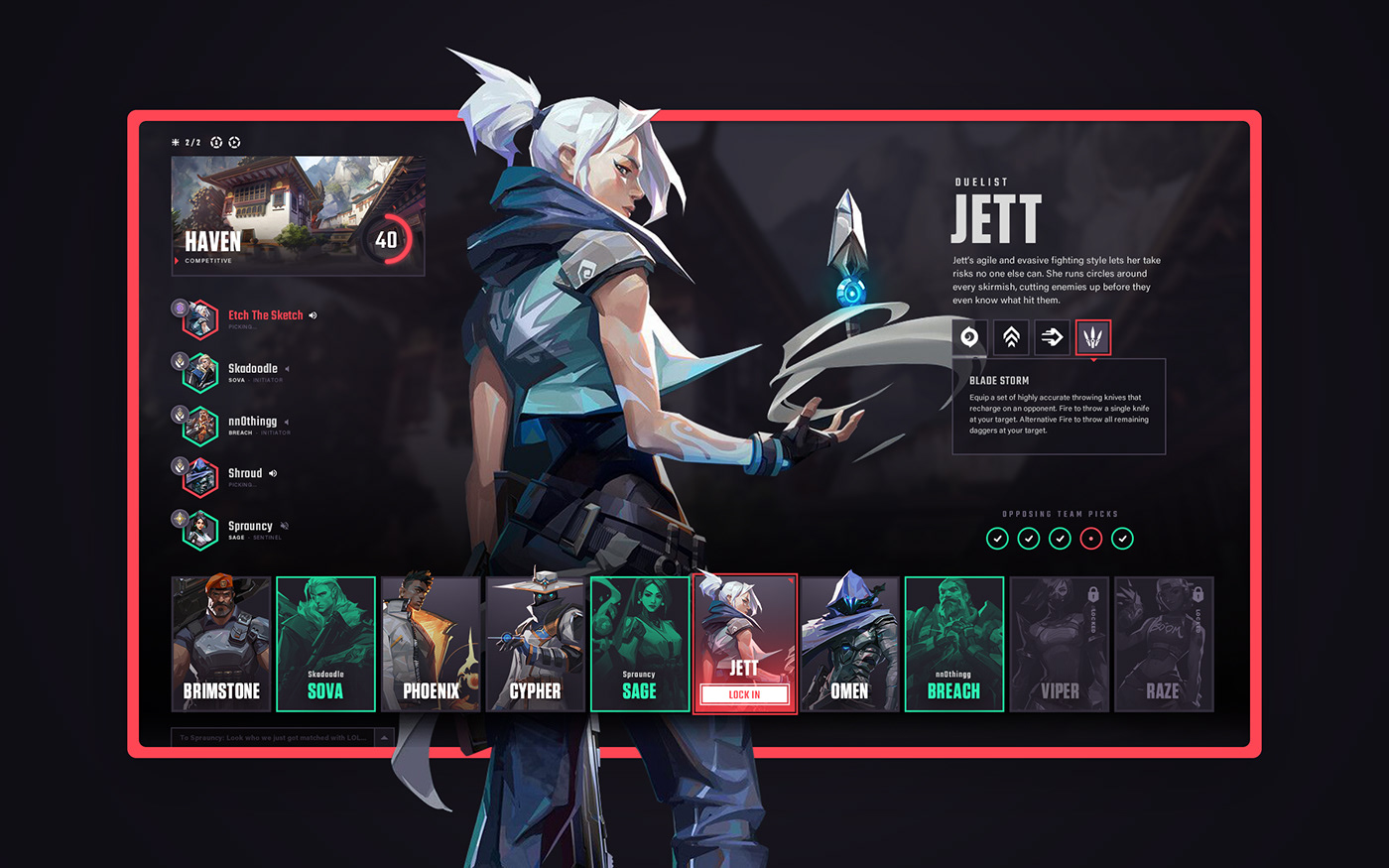
A big complaint that the general player base has with the character selection screen is how little information is given to the player. For example, there have been multiple times where people have gone to lock in an agent only to find out it’s already been picked by a teammate.
With Eckert’s redesign, people can quickly figure out which map they’re playing on, which agents have been already chosen, and what abilities each agent has. You can also easily spot the opposing team and if each player has locked in an agent.
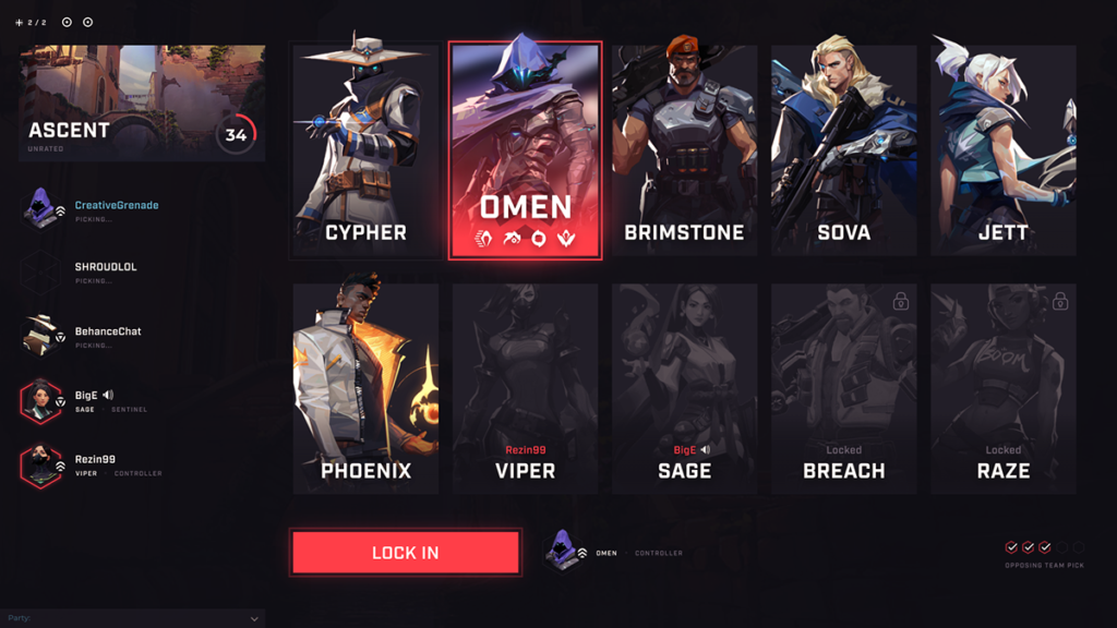
Some people preferred Howell’s version of the character selection screen because they believed that Eckert’s take had too much information and too many details that caught their attention. Howell didn’t have agent ability information in his redesign and instead expanded the character boxes across the screen.
Both versions are impressive redesigns, though, that would be welcomed by the VALORANT community.
VALORANT will be officially launched on June 2.





Published: May 25, 2020 12:23 pm