There are 16 maps in the Rainbow Six Siege Ranked pool and not all of them are fun. We all have that one map we don’t enjoy and not because it’s bad or poorly balanced.
On Oct. 3, Siege players agreed that Theme Park is one of the most boring maps to play in the game. Nothing is interesting about the map and as one player noted: “It feels like a chore to play.”
Theme Park has been in the game for a very long time and had only one substantial rework three years ago. The rework definitely made the map easier to understand and navigate, but there’s nothing exciting about it anymore. Remember, the community is discussing boring maps, not bad ones.
“Honestly I hate it cause it’s ugly, but playing it can be fun,” one player noted. No one says you can’t have a few fun games on Theme Park but overall they are quite monotonous. The looks of the map only add up to its boringness rating.
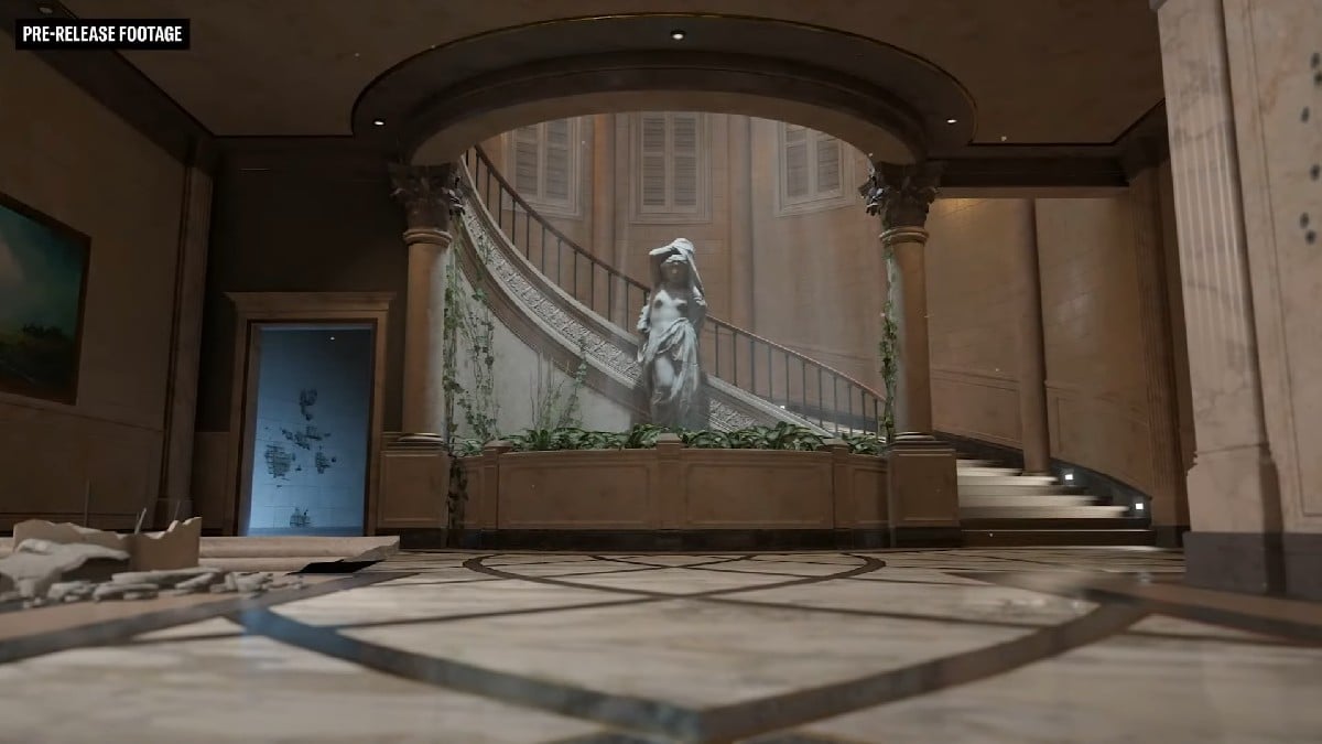
The OP’s choice for the most boring map is Villa, which I partially agree with. Much like Theme Park, it’s a decent map from the competitive side but has nothing special or unique on it. Standard linear floors, stairs, and rooms. It does look better than Theme Park, though, which is what keeps it one step ahead.
Among the other contenders for the title of the most boring map in Siege, there is Stadium. The only thing I like about the Stadium is the aesthetic of the competition and the Six Invitational. The map itself is nowhere near being fun.
“All the rooms are just copies of rooms from other maps but extremely toned down in detail. Everything just looks like concrete and drywall,” one fan wrote about Stadium. The map looks so dull that it is easy to forget which room are you in: “It takes me a couple of seconds to understand, where I am and what is in which direction.”
With Stadium, we are more leaning towards actual bad maps in Rainbow Six Sige and that’s a whole different conversation (cough.. Kanal …cough).




Published: Oct 4, 2023 07:16 am