
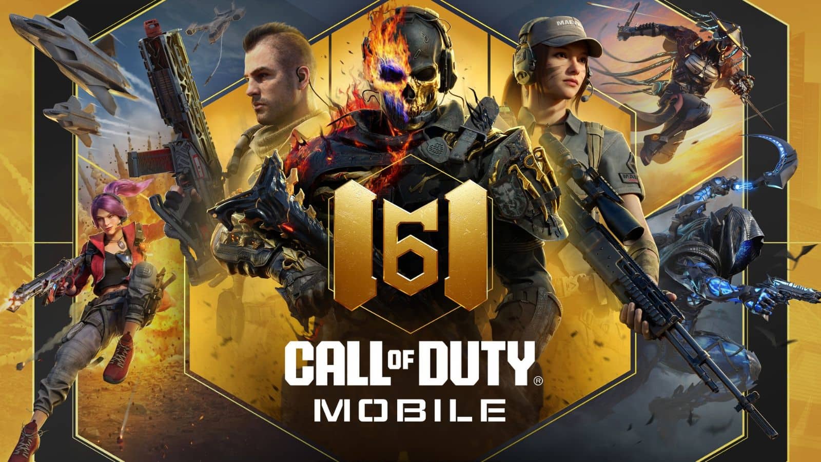
Competitive Call of Duty is a battle of attrition. It’s about gun skill, map knowledge, the ability to predict an opponent’s next move, and more.
When the league kicks off next month, 12 teams will fight for the title of the best CoD team in the world. Until then, things are pretty boring, especially since a lot of teams aren’t streaming their scrimmages. So there’s only one logical next step: to rank all 12 teams by their logos.
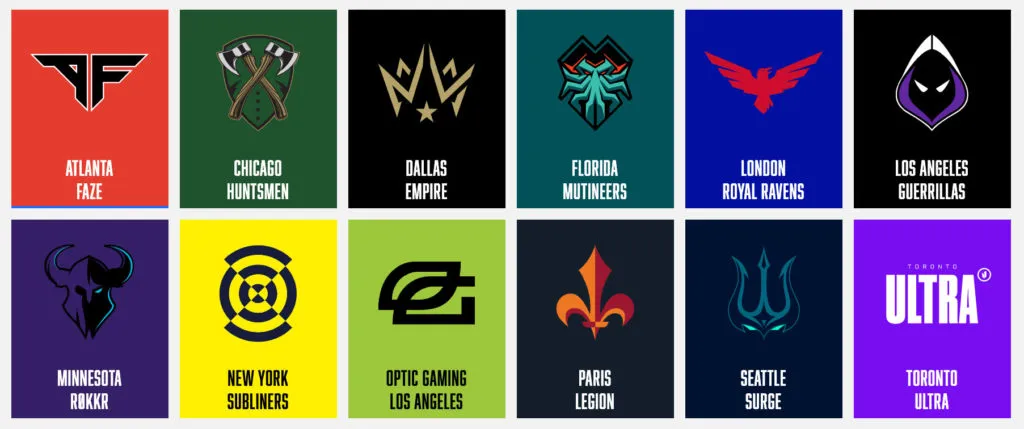
This isn’t about the rosters or the team names, it’s about a logo that looks cool enough for you to say “damn, that’s cool” or “wow, I’d buy a shirt or hat with that on it.”
Let the battle begin.
12) Toronto Ultra
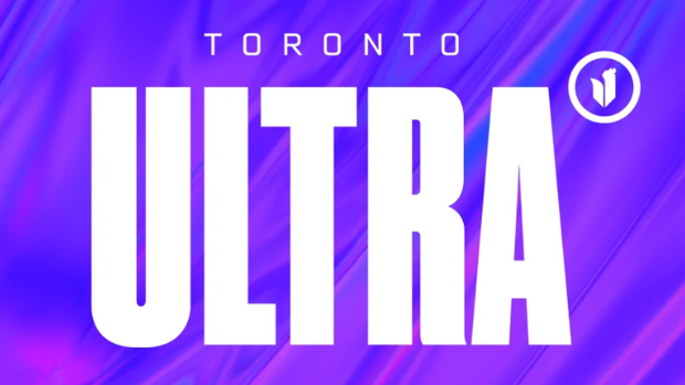
More like, Ultra-boring, am I right? There’s not a lot going on with Toronto and I think the lovely people from north of the border might be too nice to say otherwise, but Toronto deserves better than this overly simple design.
11) Paris Legion
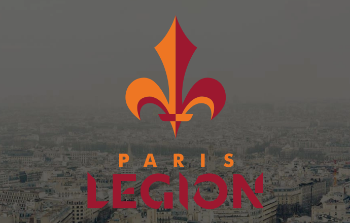
I hate to break it to our French friends, but this one’s been done already. Yes, the fleur-de-lis is a symbol of both the city of New Orleans and France’s Royal Family, but it’s hard not to look at this logo and think of black and gold and Drew Brees.
10) London Royal Ravens
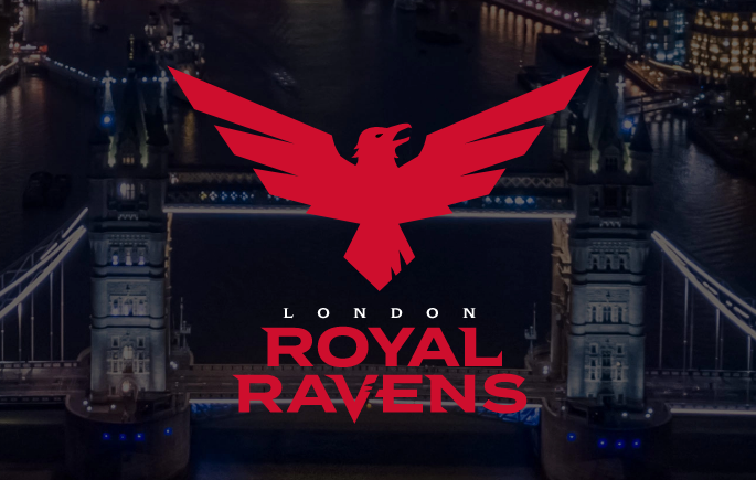
Back in the land of “overly simple,” the Royal Raven logo is a bird. And it’s red. There isn’t even any highlighting or detailing within the bird itself. It’s just flat red. More could’ve been done here and it could’ve been great, but for now, it’s just kind of boring.
9) New York Subliners
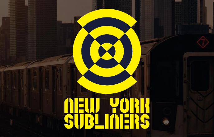
I have no idea what a Subliner is and the logo doesn’t really help. New York’s parent company, AndBox, has another abstract logo for their Overwatch League’s New York Excelsior team, and that logo grew on me after its initial launch. Let’s hope this one does the same.
8) Los Angeles Guerrillas
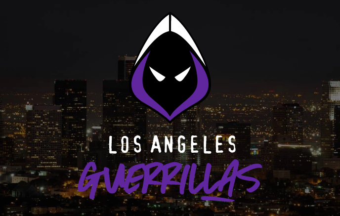
Now we’re getting into the good stuff. The black, white, and purple hooded face of the Guerrillas is a menacing figure that should strike some sense of fear in opponents while also looking sleek on a jersey.
7) OpTic Gaming Los Angeles
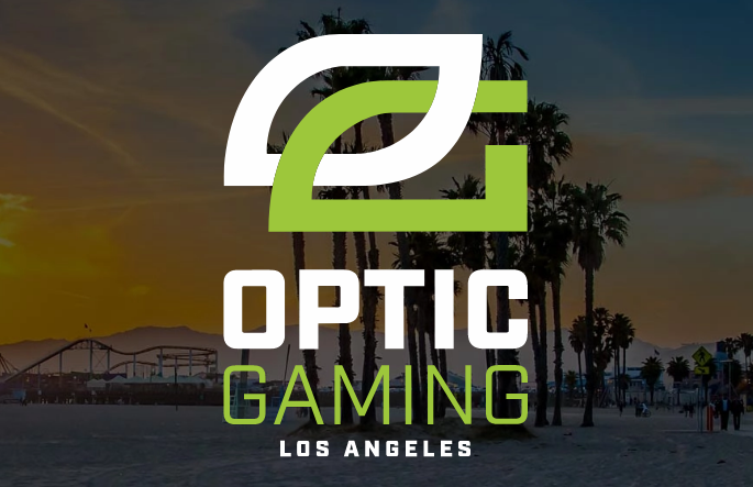
The OpTic logo is as classic as it gets in esports, but I just wish they would’ve done something, anything, with the logo to show that it’s a new era for the organization. New ownership and new location, but the same colors and the same logo. It shows that they’re the “same old OpTic” and that’s obviously not the case.
Speaking of doing something new with an existing logo…
6) Atlanta FaZe
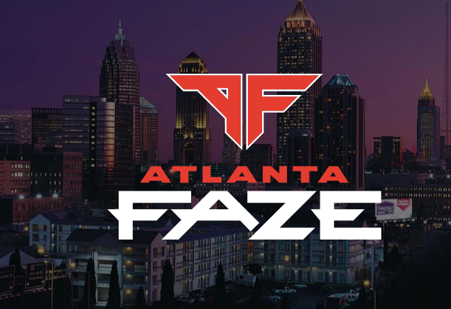
Simple but sexy. FaZe took their existing F logo and added in an A with the same font and design to make something new and fresh for the team’s new home in Atlanta. It just works really well.
5) Chicago Huntsmen
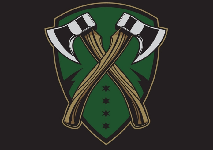
These boys are ready to hunt. Chicago went with a beautiful design of interlocking hatchets on a green shield background and it honestly looks like it could exist on the jersey or hat of any professional sports league.
4) Minnesota RØKKR
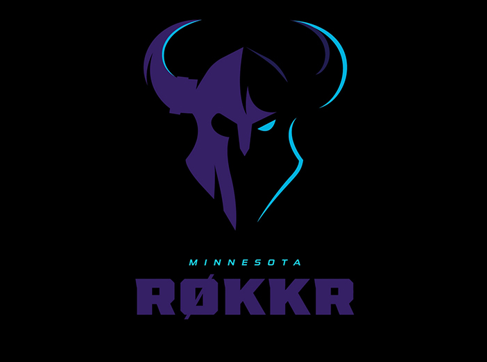
It’s not a good start for your new team when everyone has to Google just what the hell a RØKKR is, but thankfully, the squad has one of the cooler-looking logos in the league and one of the sexier color schemes to boot.
3) Dallas Empire
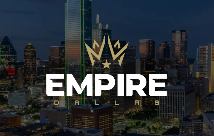
Dallas’s logo gets simplicity right. The team name is bold. Calling yourself an empire before a game has even been played is asking for a target to be put on your back, but I respect it. The logo is as clean as it gets and it’s an icon that can easily go on any piece of clothing.
2) Seattle Surge
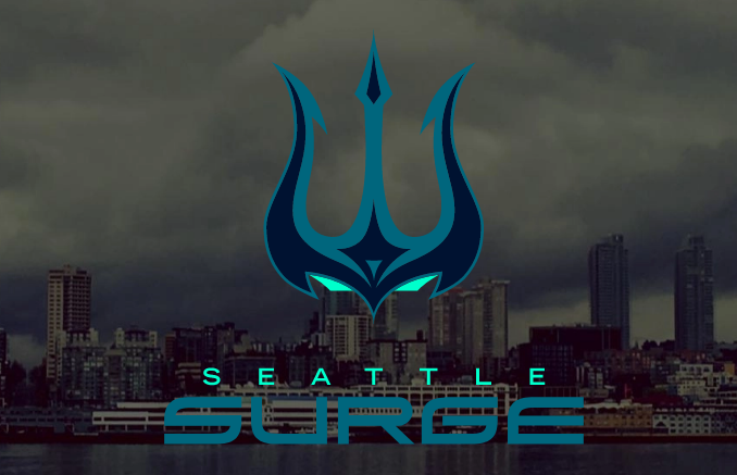
Seattle Surge went with alliteration for their team name, but somehow left the letter S out of their logo. That’s the only fault here, because the Poseidon-trident image with evil eyes peering out from underneath makes this easily one of the best-looking logos in the league.
1) Florida Mutineers
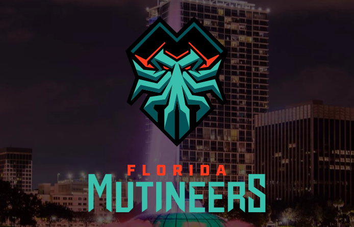
Florida gets the win for their simple ability to include both badass imagery and some sort of lettering to denote the team’s name. See the M in the squid-face’s hat? M for Mutineers and V for Victory in the logo war.
The Mutineers logo stands above the rest as the coolest one of the bunch.

Published: Dec 23, 2019 03:55 pm